CSS Masonry Generator: Build Pinterest-Style Masonry Layouts With Pure CSS
CSS Masonry Generator lets you visually build a true masonry layout with pure CSS and a multi-column fallback, complete with a live preview and copy-paste HTML and CSS output.
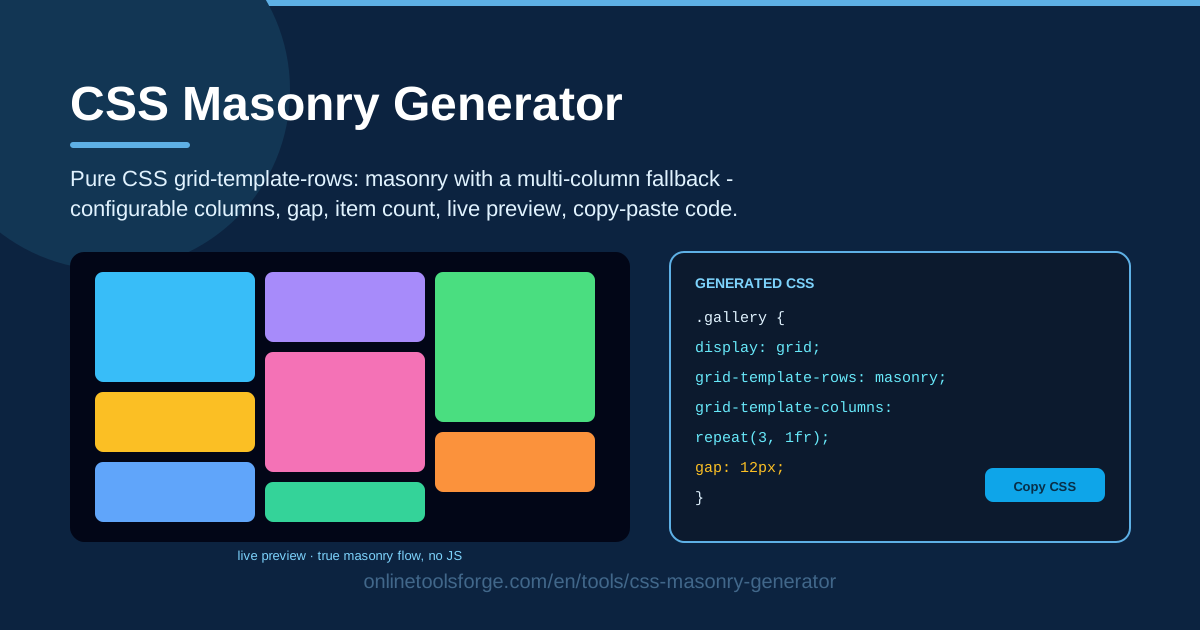
Table of Contents
Masonry layouts — the staggered, brick-like columns that made Pinterest famous — have always been awkward to build on the web. Standard CSS grid forces every row to align, so items of different heights leave ragged gaps, and the classic workaround meant shipping a JavaScript library just to arrange boxes. The CSS Masonry Generator on Online Tools Forge takes a different approach: design the layout visually, then get clean HTML and CSS built on grid-template-rows: masonry, paired with a multi-column fallback for older browsers.
Because everything runs in your browser, you can tweak columns, gap, and item count and watch the live preview respond instantly. When you are happy, you copy the generated HTML and CSS straight into your project — no sign-up, no dependencies, no lock-in.
This guide covers why the tool is worth using, a five-step workflow from blank canvas to production-ready markup, and how native CSS masonry works under the hood.
Why Use CSS Masonry Generator?
- True masonry without JavaScript. The generated CSS relies on grid-template-rows: masonry, so the browser packs items into columns natively — no layout library, no runtime cost, no layout shift from height-measuring scripts.
- Visual, instant feedback. Adjust the controls and see the layout respond in real time, far faster than a save-and-refresh loop.
- Configurable density. Columns, gap, and item count are all adjustable, from a tight three-column gallery to an airy five-column card wall.
- Graceful degradation. Browsers without native masonry still get a tidy multi-column fallback instead of collapsing into one long column.
- Copy-paste output you can trust. Clean, readable HTML and CSS that drops into a static site, a React component, or a CMS template.
- Free and private. Everything happens locally in your browser; nothing is uploaded and no account is needed.
Key Features
| Feature | What it does |
|---|---|
| Visual masonry builder | Configure the layout with simple controls instead of hand-writing CSS |
| Pure CSS masonry | Uses grid-template-rows: masonry so the browser packs items natively |
| Multi-column fallback | Gives older browsers a CSS multi-column layout |
| Configurable columns and gap | Set column count and item spacing to match your design system |
| Adjustable item count | Control how many preview tiles are generated |
| Live preview | See every change reflected immediately |
| Copy-paste output | Get ready-to-use HTML and CSS you can paste anywhere |
Two details worth calling out:
- Native masonry plus a fallback means you write the layout once and let the browser pick the best available rendering path — textbook progressive enhancement.
- The generated CSS is only a handful of declarations, adding virtually nothing to page weight compared with a typical masonry JavaScript library.
How to Use CSS Masonry Generator
- Set columns and gap. Choose the column count and spacing between items. Three to five columns with a 12-24px gap suits most photo walls; wider gaps read calmer for text cards.
- Add items. Set the item count so the tool generates preview tiles, and imagine your real content in each block — varied heights are what make masonry shine.
- Preview live. Compare a dense arrangement against a sparse one in seconds and settle on the sweet spot.
- Check the fallback. Look at the multi-column output and consider how your content order reads when items flow down one column before the next.
- Copy the HTML and CSS. Paste the generated markup and styles into your project and swap the placeholder tiles for real content.
Native Masonry and the Multi-Column Fallback
The heart of the generated CSS is grid-template-rows: masonry. In a normal grid, rows are rigid tracks: every item in a row shares the same height, so a short card wastes space beside a tall one. The masonry value tells the browser to relax that constraint and pack each item into the column with the most remaining space — true masonry computed by the layout engine, not a script.
Browser support is the honest caveat: the feature is still experimental, and no stable browser ships it today. That is why the tool pairs it with a multi-column fallback. With column-count and break-inside: avoid, older browsers render your items as balanced vertical columns instead of a single stack — visually close, with varied-height tiles in side-by-side columns.
The fallback has one behavioral difference worth knowing: multi-column fills the first column from top to bottom before starting the second, so reading order runs down-then-across, while true masonry places items across the row first and a 1, 2, 3 sequence reads left to right. If order matters — numbered steps, chronological feeds — test how the fallback arranges your content.
Gap and column count also trade off differently in each mode: tight gaps look great in masonry but produce narrow, newspaper-like columns in the fallback, so slightly larger gaps keep both readable. Reach for a library like Masonry.js only if you need identical left-to-right ordering everywhere, animated re-layout, or pixel-perfect parity on very old browsers; otherwise native masonry plus the fallback is lighter, faster, and improves automatically as support lands.
Practical Use Cases
Photo Galleries
Photographs rarely share one aspect ratio, which is exactly why uniform grids disappoint. A masonry gallery keeps every image at full column width and crops nothing, so a portrait shot sits snugly beside a landscape. Four columns with a modest gap is a reliable starting point; drop to three for larger thumbnails.
Blog Card Walls
Content sites with mixed card heights — some posts with images, some text-only — benefit from masonry's packing, because short cards do not punch holes into the grid. Keep card heights moderately varied so the wall looks intentional rather than chaotic.
Portfolio Grids
Designers often want project tiles of differing heights to signal variety while keeping the page dense and scannable. A three-column masonry portfolio with a generous gap and hover effects delivers that gallery feel without a single line of JavaScript.
Product Listing Pages
Marketplaces can use masonry for visually driven catalogs — art prints, furniture, handcrafted goods — where product photos vary in shape. Keep text overlays minimal and consistent so prices and titles stay scannable across the staggered columns.
Best Practices
- Always ship the fallback. No stable browser guarantees native masonry today, so treat the multi-column fallback as part of the design, not an afterthought.
- Keep items similar in tone. Masonry handles varied heights beautifully, but clashing colors and typography make the wall feel random — let heights create the variety.
- Test content order for readability. The fallback reads down each column, so put important items early and check both rendering modes.
- Pair with lazy loading. Image-heavy walls get heavy fast, so add native loading="lazy" to below-the-fold images.
- Match the gap to your spacing scale. Reuse the gap value your design system uses elsewhere so the masonry section feels like part of the same product.
- Avoid hard horizontal sequencing. If item 3 must sit to the right of item 2 everywhere, native packing may not honor it — reorder content or use a regular grid.
Ready to see it in action? Open the CSS Masonry Generator, set your columns, gap, and item count, and copy your finished layout in under a minute — no account, no install, and no JavaScript required.
Related Tools You Might Like:
- Bento Grid Generator — design modern bento-box layouts with clean grid CSS.
- Flexbox Generator — build flexbox rows, columns, and alignment visually.
- CSS Spinner Generator — create pure-CSS loading spinners for any page.
Happy building!
Frequently Asked Questions
Q: Can I build a masonry layout with pure CSS and no JavaScript? A: Yes. The CSS Masonry Generator produces CSS based on grid-template-rows: masonry, which lets the browser pack items into columns natively; the multi-column fallback ensures every browser still gets a good-looking layout.
Q: Which browsers support grid-template-rows: masonry? A: At the time of writing, no stable browser ships it, though Firefox has prototyped it behind a flag and Chrome is exploring its own approach. The generated code follows progressive enhancement: browsers that understand masonry get true masonry, and the rest get the multi-column fallback.
Q: What is the difference between masonry and a regular CSS grid? A: A regular grid fixes every row to the same height, so shorter items leave empty space beside taller neighbors. Masonry relaxes the row constraint and packs each item into the column where it fits best, eliminating most wasted vertical space.
Q: Can I use the generated code in React, Next.js, or WordPress? A: Absolutely. The output is plain HTML and CSS with no dependencies, so you can paste it into a component, a static site, or a theme template, then swap the placeholder tiles for your own content.