CSS Easing Cheatsheet: Master Cubic-Bezier Curves and Transition Presets
Explore 40+ named CSS easing keywords and curated cubic-bezier presets with live animated previews in the CSS Easing Cheatsheet, then copy-paste production-ready transition declarations in seconds.
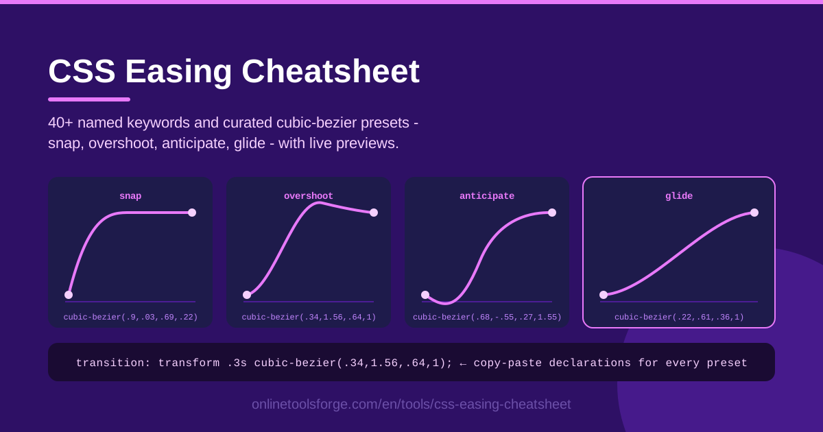
Table of Contents
When a button snaps into place, a drawer glides open, or a card settles with a little spring, what you are really watching is an animation timing function doing its job. Easing is the invisible craft behind every CSS transition: it decides whether motion feels crisp, luxurious, playful, or broken. Yet most developers reach for the same tired ease keyword and never discover how much personality the right curve can add.
That is exactly the problem the CSS Easing Cheatsheet was built to solve. Instead of memorizing cubic-bezier numbers or guessing what a curve looks like, you can browse 40+ named CSS easing keywords alongside curated presets like snap, overshoot, anticipate and glide, watch each one play out on a live animated preview, and copy a ready-made transition declaration straight into your stylesheet.
In this guide we will walk through how the tool works, how to actually read a cubic-bezier curve, and which easing patterns fit buttons, drawers, games, and loading states best.
Why Use CSS Easing Cheatsheet?
- See every curve before you commit. A wall of raw numbers like cubic-bezier(0.68, -0.55, 0.265, 1.55) tells you nothing. The live animated preview shows exactly how each curve moves, so you judge with your eyes instead of your imagination.
- Curated presets, not guesswork. Hand-picked curves named snap, overshoot, anticipate and glide describe their personality at a glance, which beats reverse-engineering anonymous bezier values.
- All 40+ named keywords in one place. From linear to ease-in-out, every standard easing keyword sits next to its custom-curve cousins so you can compare them side by side.
- Copy-paste declarations, not fragments. Each preset ships as a complete, valid transition declaration, eliminating typos in your cubic-bezier values.
- Runs entirely in the browser. No sign-up, no install, no build step. Open the tool, compare curves, copy, and get back to coding.
- Instantly higher perceived quality. Motion with a well-chosen timing function makes the same interface read as more polished and responsive, and this tool makes the good choice effortless.
Key Features
| Feature | What it does |
|---|---|
| Named keyword library | Browse 40+ CSS easing keywords (ease, ease-in-out, linear and friends) with guidance on when each one shines |
| Curated cubic-bezier presets | Hand-picked custom curves like snap, overshoot, anticipate and glide with descriptive names and use cases |
| Live animated preview | A ball or box animates on every curve in real time, so you can judge the feel instantly |
| Copy-paste declarations | Every preset is offered as a complete transition declaration ready to drop into your stylesheet |
| Fully browser-based | Nothing to install or configure; open the page and start comparing curves |
A few details worth highlighting:
- The preview loops continuously, which makes the subtle differences between two similar curves obvious in a way a static graph never could.
- Because presets are presented as whole declarations, there is no risk of a mistyped number silently changing your animation.
- The friendly naming gives your team a shared vocabulary: "use the glide curve on the drawer" is easier to communicate than a string of coordinates.
How to Use CSS Easing Cheatsheet
- Browse the presets. Open the cheatsheet and scroll through the named easing keywords and the curated cubic-bezier presets. Names like snap, overshoot, anticipate and glide tell you the personality of each curve before you watch it.
- Watch the live preview. Every entry comes with an animated ball or box that demonstrates the curve in real time. Let at least one full loop play - the difference between two neighboring curves is far easier to see in motion than on paper.
- Pick the curve that matches your intent. Ask what the element should feel like: immediate and confident (snap), smooth and unhurried (glide), or playful with a visible recoil (overshoot) or a small wind-up (anticipate).
- Copy the transition declaration. Grab the complete, ready-to-paste declaration for your chosen curve - no assembling fragments or hand-typing bezier values.
- Apply it to your own transition. Paste the declaration into your CSS, pair it with a sensible duration (150-300ms is a great starting range), and test it in the real interface. If something feels off, hop back to the cheatsheet and try an adjacent curve.
Reading a Cubic-Bezier Curve
A cubic-bezier value looks like cubic-bezier(x1, y1, x2, y2) and defines the pace of a transition with four numbers. The x-axis is time, progressing from 0 to 1 across the duration of the animation. The y-axis is output progress - how far the animated property has traveled toward its target. The curve always starts at (0, 0) and ends at (1, 1); the two control points bend the path between those fixed endpoints.
The x-values must stay within the 0-1 range, because time cannot run backwards. The y-values are unrestricted, and that is where the expressive power lives. A y-value above 1 means the property briefly travels past its destination before settling back - the mechanics behind every overshoot effect. A y-value below 0 pulls the property slightly in the opposite direction first, creating the wind-up you see in an anticipate curve.
Named keywords such as ease, ease-in, ease-out, ease-in-out and linear are simply shortcuts for specific cubic-bezier values. Linear is (0, 0, 1, 1): constant speed, ideal for spinners and color fades but rarely right for movement. The default ease is roughly (0.25, 0.1, 0.25, 1). The cheatsheet lays these out together so you can graduate from keywords to custom curves with confidence.
This matters because easing changes the perceived quality of your UI more than almost any other motion decision. Two identical animations with different timing functions read as cheap versus premium, or sluggish versus responsive. A 200ms transition with a strong ease-out feels dramatically faster than the same transition on linear timing, because our eyes notice how motion starts, not just how long it takes.
Duration pairing matters just as much as the curve itself. Snappy presets suit 150-200ms. Glide-style curves can stretch to 300-500ms on larger movements without feeling slow. Overshoot curves usually want a little extra time, around 250-400ms, so the recoil is actually visible. If an animation feels wrong, adjust the duration first; if it still feels wrong, the curve is the culprit.
Practical Use Cases
Buttons and Hover States with Snap
Interactive feedback wants to be immediate. A snap-style curve applied to transform or box-shadow gives buttons and cards a crisp, confident response with no mushy ramp-up. Keep durations near 150ms so the hover feels instant, and apply the same declaration consistently to every interactive element.
Drawer Slide-Ins with Glide
Navigation drawers, sidebars and bottom sheets travel a long distance, so an aggressive snap feels jarring. A glide preset with a gentle deceleration feels calmer and more physical. Pair it with 300-400ms, and use the mirrored curve for the exit so the drawer leaves the way it arrived.
Playful Gaming UIs with Overshoot
Score popups, reward badges and level-up banners are the perfect home for overshoot curves, whose y-values above 1 let elements fly past their target and bounce back. Anticipate curves add a small reverse wind-up before a jump, a classic animation principle that makes game feedback feel alive. Just save these energetic curves for accents - a form field that overshoots on every keystroke quickly becomes exhausting.
Loading Spinners and Linear Motion
Spinners are the one case where linear genuinely wins: a rotating element should cover equal distance in equal time, and any other easing makes the rotation pulse. Linear also suits color fades and indeterminate progress bars. For complete, ready-made loaders, pair this cheatsheet with the tools listed at the end of this article.
Best Practices
- Ease-out for entrances, ease-in for exits. Elements arriving should start fast and settle gently; elements leaving should accelerate away, the way objects behave in the physical world.
- Keep durations in the 150-300ms sweet spot. Micro-interactions below 150ms feel twitchy, and anything past 500ms starts to read as lag rather than polish.
- Respect prefers-reduced-motion. Wrap decorative animations in a @media (prefers-reduced-motion: reduce) query and swap big movements for simple fades.
- Stay consistent per app. Choose two or three curves, name them in your design tokens, and reuse them everywhere. A library of forty random easings looks chaotic; three deliberate ones look designed.
- Reserve overshoot for accents. Springy motion draws attention, which is exactly why it should mark rewards and celebrations, not everyday navigation.
- Tune duration and curve together. A great curve at the wrong duration still feels broken, so adjust both when polishing an animation.
Stop guessing what cubic-bezier(0.68, -0.55, 0.265, 1.55) looks like. Open the CSS Easing Cheatsheet, watch 40+ keywords and curated presets play out on a live animated preview, and copy a production-ready transition declaration in a single click. Your next animation will feel intentional within seconds.
Related Tools You Might Like:
- CSS Animation Generator - build complete keyframe animations with custom timing.
- CSS Spinner Generator - generate loading spinners in every style.
- CSS Starting Style Generator - craft smooth entry transitions with @starting-style.
Happy animating!
Frequently Asked Questions
Q: What is the difference between a named easing keyword and a cubic-bezier value? A: Named keywords such as ease, ease-in-out and linear are predefined shortcuts that map to specific cubic-bezier values. Custom cubic-bezier curves let you fine-tune the exact pace, and y-values outside 0-1 unlock overshoot and wind-up effects that no keyword can express.
Q: Can cubic-bezier y-values be greater than 1 or less than 0? A: Yes. Only the x-values are locked between 0 and 1, because they represent time. Y-values above 1 make the element briefly travel past its target (overshoot), while negative y-values create a small reverse wind-up (anticipate) before the motion begins.
Q: What duration should I pair with an easing curve? A: For most interface transitions, 150-300ms works well. Short distances and hover states suit the lower end, larger movements like drawers suit the higher end, and overshoot presets usually need a little extra time so the recoil is visible.
Q: Does easing affect animation performance? A: The timing function itself is essentially free. What matters is animating transform and opacity instead of layout properties like width or top. With GPU-friendly properties, any curve from the cheatsheet will run smoothly at 60fps.