Bento Grid Generator: Build Apple-Style Layouts in Minutes
Learn how to use the Bento Grid Generator to design asymmetric, Apple-style bento grid layouts with a live preview and copy-paste HTML plus a ready style block.
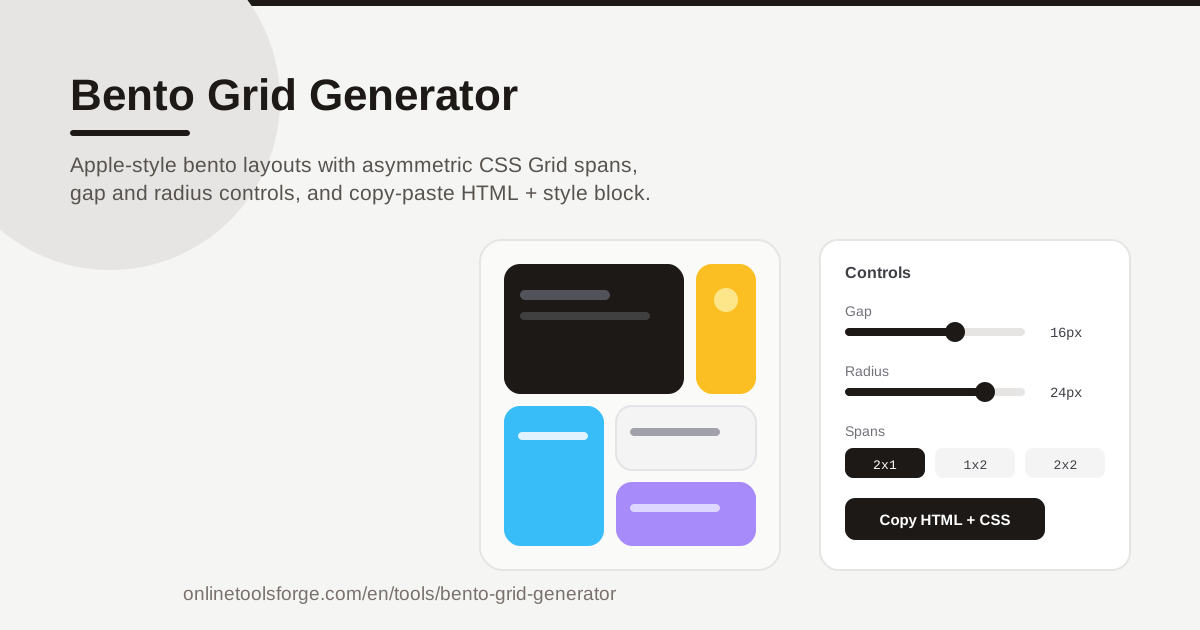
Table of Contents
Some layouts just look premium. Scroll through an Apple keynote page or a modern SaaS landing page and you will notice the same pattern: a tidy mosaic of rounded tiles, some tall, some wide, all snapping together like a Japanese bento box. That is the bento grid, one of the most recognizable layout styles on the web today.
Recreating one by hand means wrangling CSS Grid syntax, calculating spans, and eyeballing gaps and radii until things look right. The Bento Grid Generator removes that friction. Compose tiles visually, set asymmetric spans per cell, tune the gap and corner radius with sliders, watch the live preview update instantly, then copy production-ready HTML with a ready style block. Everything runs in your browser — no account, no build step, no dependencies.
Why Use Bento Grid Generator?
- Zero setup. The tool runs entirely in your browser — nothing to install, no account to create. Open the page and start composing.
- True bento aesthetics without the math. Apple-style grids depend on asymmetric tile sizes; the generator handles the span math so you can focus on composition.
- Live preview as you design. Every change to cells, spans, gap, or radius renders immediately — you never edit code blind.
- Copy-paste output that just works. Exports clean HTML plus a ready style block that renders exactly as previewed, in any project.
- Consistent spacing by default. Gap and radius controls apply grid-wide, which is what gives bento layouts their tidy, rhythmic feel.
- A fast way to learn CSS Grid. Watching the generated style block change as you adjust spans is a hands-on lesson in grid-column and grid-row.
Key Features
| Feature | What it does |
|---|---|
| Bento tile composer | Add, arrange, and style Apple keynote-style tiles in a visual editor |
| Asymmetric spans | Set per-cell sizes like 2x1, 1x2, or 2x2 with a click |
| Live preview | See every change rendered instantly in the browser |
| Gap control | Tune the space between tiles across the whole grid |
| Corner radius control | Soften or sharpen every tile edge uniformly |
| Copy-paste HTML export | Grab the markup plus a ready style block, ready to paste |
| Browser-based | No install, no account — everything runs client-side |
A few details worth calling out:
- Spans are per cell, not per layout. Each tile carries its own grid-column and grid-row span, so a wide 2x1 banner, tall 1x2 columns, and square 1x1 cells can share one grid.
- The style block mirrors your controls. Move the gap slider and the exported CSS updates to match — preview and code never drift apart.
How to Use Bento Grid Generator
- Add your first cells. Open the Bento Grid Generator and start composing tiles. Four to six cells is enough to feel the pattern.
- Set asymmetric spans. Give each cell a size — 1x1 for accents, 2x1 for wide banners, 1x2 for tall columns, 2x2 for the hero. The preview reflows instantly.
- Tune the gap and corner radius. Tight gaps (8-16px) with generous radii (16-24px) produce the classic soft, modern look.
- Check the live preview. One dominant 2x2 tile anchored by smaller satellites reads best — adjust until no corner feels heavier than the rest.
- Copy the HTML and style block. Paste the generated HTML with its ready style block into your page; it renders exactly as previewed.
Bento Layouts and CSS Grid Spans
What separates a bento grid from an ordinary card grid is deliberate asymmetry. A uniform grid of identical squares looks like a photo wall; a bento mixes tile sizes to pull the eye toward a focal point. A 2x2 hero might hold a headline, flanked by a 2x1 stat strip, a tall 1x2 column, and a scatter of 1x1 accents — different sizes, one ordered whole.
CSS Grid makes this trivial once you know the trick: spans. Every cell starts at 1x1. A cell spanning two columns declares grid-column: span 2; one spanning two rows declares grid-row: span 2. Combine both for the 2x2 hero. The auto-placement algorithm then packs the remaining cells around the big ones like puzzle pieces, filling holes and keeping edges flush.
That is why the generator exposes spans per cell instead of explicit coordinates — mixed spans plus auto-placement produce a professional result with far less code.
Gap and radius do the rest of the aesthetic work. The gap sets the rhythm of the layout: tight gaps feel dense and technical, wider gaps airy and editorial. The corner radius is the most recognizable bento trait — radii around 20px on every tile create the soft, rounded, Apple keynote look, while small radii read more utilitarian. Both controls apply grid-wide and are mirrored in the exported style block.
Responsive behavior is where hand-rolled bento grids usually break. On narrow screens, large spans cannot hold their shape, so the practical pattern is to collapse: wide and square tiles fall back to single-column spans, stacking into a clean vertical rhythm. If needed, add a small media query that resets spans to 1 — a few lines of CSS keeps the layout graceful from desktop to phone.
Practical Use Cases
Feature showcases on landing pages
A bento grid is the modern answer to the tired three-column feature list. Give the 2x2 tile to your headline feature with a screenshot, hand 2x1 tiles to secondary features with short blurbs, and fill the remaining 1x1 cells with icons and one-line benefits. The asymmetry signals hierarchy instantly.
Personal homepages
Link-in-bio pages are the perfect bento canvas. A tall 1x2 tile holds your avatar and intro, wide tiles link to your newsletter or latest project, and small square cells carry social icons. The result looks designed rather than templated, and the plain-HTML export drops into any static host.
Dashboard cards
Admin panels and analytics summaries benefit from the same rhythm. Metric tiles — revenue, active users, conversion — can be 1x1 or 2x1 depending on importance, a 2x2 tile hosts the primary chart, and the consistent gap keeps everything scannable. The grid communicates priority through size.
Portfolio highlights
Designers and agencies present case studies in bento form: one dominant tile for the flagship project, medium tiles for secondary work, small tiles for experiments or awards. Mixing sizes makes a modest portfolio feel curated rather than exhaustive.
Best Practices
- Anchor the grid with one hero tile. Every strong bento has a clear focal point, usually a 2x2 — let it carry your headline and let smaller tiles support it.
- Keep internal padding consistent. Match each tile's padding to your gap value or a multiple of it; mismatched padding is the fastest way to make a bento look off.
- Limit the palette. Two or three tile background colors — one dark, one light, one accent — keep the mosaic cohesive.
- Test mobile collapse early. If large-span tiles look cramped at phone width, add a media query that resets spans to single columns.
- Resist overfilling. Five to eight tiles is the sweet spot; beyond that the grid reads like a spreadsheet.
- Pair the radius with your brand. If your site uses sharp corners elsewhere, soften the bento radius slightly rather than clashing.
Ready to build one? Open the Bento Grid Generator, drop in a few tiles, set your spans, and slide the gap and radius until it clicks. Within minutes you will have a copy-paste grid that looks like it took an afternoon.
Related Tools You Might Like:
- Flexbox Generator — build flexible one-dimensional layouts with visual controls.
- Box Shadow Generator — add depth to your bento tiles with layered shadows.
- Border Radius Generator — fine-tune corner styles for tiles and buttons.
Happy building!
Frequently Asked Questions
Q: What is a bento grid? A: A layout pattern of rounded, asymmetric tiles of mixed sizes arranged in a CSS Grid, named after the compartmentalized Japanese bento box. One large hero tile is typically surrounded by smaller tiles, creating a mosaic that feels organized yet dynamic.
Q: Do I need to know CSS Grid to use the generator? A: No. You compose tiles visually and the tool generates the HTML and style block for you. Reading the exported CSS afterward is also a great way to learn how spans work.
Q: Can I edit the copied HTML afterwards? A: Yes. The export is plain HTML with a ready style block, so you can rename classes, change colors, or merge it into any framework. The structure stays valid as long as you keep the span declarations intact.
Q: Is the tool free? A: Yes. Bento Grid Generator runs entirely in your browser with no account, installation, or payment required.