Neubrutalism Generator: Design Bold Neo-Brutalist Cards in Your Browser
Design neo-brutalist cards with the Neubrutalism Generator — thick borders, hard offset shadows, bold color pairings, and copy-paste HTML with a ready CSS block.
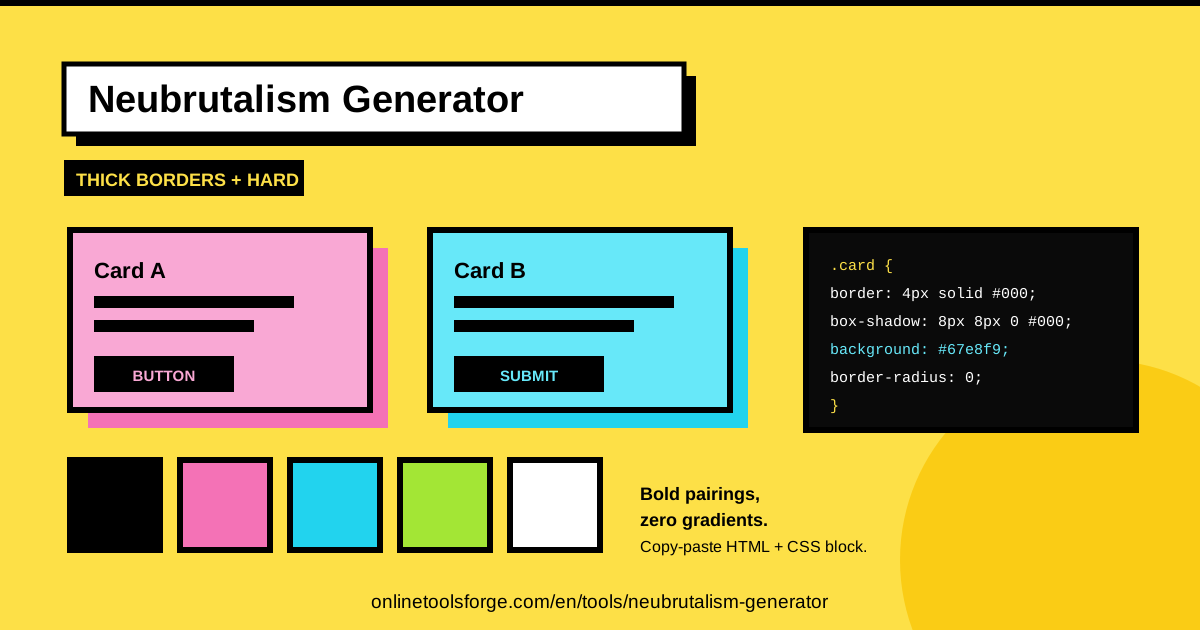
Table of Contents
Design trends move in cycles, and few comebacks have been as loud as neubrutalism. Between the sterile minimalism of the last decade and today's glassy, blurred surfaces, designers started craving something more honest: raw borders, clashing colors, and shadows that look inked with a marker. If you want to join that movement without hand-writing every style rule, the Neubrutalism Generator gets you there in minutes, entirely in your browser.
The tool does the heavy lifting. It designs neo-brutalist (neubrutalism) cards with thick borders, hard offset shadows such as 8px 8px 0 #000, and bold color pairings, all rendered in a live preview as you tweak the controls. When the card looks right, you copy-paste clean HTML together with a ready CSS block — no frameworks, no build steps, no sign-ups.
This guide covers why neubrutalism works on the modern web, how to use the generator step by step, the anatomy of the style itself, and where a brutalist card genuinely earns its place in real projects.
Why Use Neubrutalism Generator?
- Zero setup, zero installs. The generator runs entirely in your browser, so you can open it on a lunch break and ship the finished card before your coffee goes cold.
- Instant visual feedback. The live preview updates as you adjust border thickness, shadow offset, and colors — far better than the guess-and-refresh loop of editing CSS files.
- Copy-paste output that just works. You get HTML markup plus a ready CSS block, so the card you designed is the card you deploy, pixel for pixel.
- A crash course in the style. Every control maps directly to a CSS declaration, so you learn how neubrutalism is constructed while you play.
- Consistent, opinionated results. Because the tool is built around the core rules of brutalist design, it stops you drifting into a half-neubrutalist look that satisfies no one.
- Free and friction-free. No accounts, no watermarks, no feature walls. The whole point of the style is honesty, and the tool practices it.
Key Features
| Feature | What it does |
|---|---|
| Neo-brutalist card design | Builds card layouts in authentic neubrutalism style for landing pages, portfolios, and promos |
| Thick borders | Applies heavy outlines that define the silhouette of every card and button |
| Hard offset shadows | Creates solid shadows like 8px 8px 0 #000 with no blur, the most recognizable trait of the style |
| Bold color pairings | Suggests high-contrast, unblended color combinations instead of timid gradients |
| Live preview | Renders your card in real time as any setting changes, so decisions take seconds |
| Copy-paste HTML + ready CSS block | Delivers clean markup with matching styles you can drop straight into any project |
Two details deserve extra attention:
- The hard offset shadow is the signature move. A solid, unblurred slab of color offset behind the card is what gives neubrutalism its print-poster energy, and the generator nails the values for you.
- The output is framework-agnostic. Because it is plain HTML and CSS, you can paste it into static sites, WordPress, React, or anything else that renders markup.
How to Use Neubrutalism Generator
- Pick your colors. Start with the card background and an accent. Neubrutalism loves high-energy duos — yellow and black, pink and deep blue, lime and white. Choose a background that carries dark text comfortably.
- Set the border thickness and shadow offset. Push the border to 3px or thicker and pick a shadow offset between 4px and 10px. The larger the offset, the more the card physically pops off the page.
- Shape the card. Keep the border-radius at or near zero and give the content generous padding. The style depends on hard rectangles and unapologetic space.
- Check the live preview. Watch the card render in real time and adjust until the hierarchy reads clearly: headline, body, then call-to-action button, each with progressively more visual weight.
- Copy the HTML and the ready CSS block. Paste both into your project, check them in context, and tweak colors if the surrounding page demands it. Done in under five minutes.
The Anatomy of Neubrutalist Design
Knowing why the style looks the way it does helps you push it further.
Thick borders. Thin borders whisper; thick borders declare. A 3-5px black border outlines a card the way a comic panel is inked, and it gives the hard shadow a clean edge to sit against. Borders stay solid black or a very dark tone, which anchors even the loudest color scheme.
Hard offset shadows versus soft shadows. Mainstream UI uses blurred, translucent shadows to fake depth gently. Neubrutalism rejects the blur: a shadow like 8px 8px 0 #000 is a single flat color, offset diagonally, with zero feathering. The element reads as a sticker or a cutout rather than a floating window. Swap every blurry shadow for a solid offset block and you are halfway to brutalism.
Flat, unblended color pairings. Gradients and translucency are nowhere to be found. Neubrutalism pairs saturated, unmixed hues — mustard against cobalt, hot pink against stark white — with hard edges between them. The colors do not negotiate; that friction is the visual energy of the style.
Why border-radius stays at or near 0. Rounded corners soften a design and soften its message. Brutalism stays unsoftened, so corners remain square or take only a token 2-4px radius. Squares echo the zine and construction-paper heritage of the movement, and they let the offset shadow copy the exact silhouette.
Contrast-driven typography. With heavy borders and loud colors doing the talking, type must fight back: bold display fonts, tight headlines, often uppercase, and stark black-on-bright text. Spacing is deliberate — generous padding inside cards, hard separations between sections. Everything is divided by a line, never a fade.
Practical Use Cases
Indie Landing Pages That Refuse to Blend In
A one-person product competes on personality, and neubrutalism delivers it by default. Build a hero card, a pricing card, and a call-to-action with the generator, and the page instantly reads as handmade and confident — the opposite of template SaaS. Bold color blocks also photograph well in screenshots, which helps when you share the launch online.
Portfolio Personality With Real Edge
Clients skim dozens of near-identical portfolios. A neubrutalist project grid makes your work feel curated and loud in the best way: one card per project, a single bold accent each, thick borders doing the organization without extra chrome. It also signals you understand current design movements, not just how to follow a UI kit.
Event and Promo Pages Built to Be Noticed
Concerts, workshops, pop-up markets, product drops — anything with a date and a deadline benefits from poster energy. A neubrutalist card with a hard shadow channels the photocopied gig flyer, and the copy-paste HTML means you can assemble the page the night before tickets go live.
Brand Campaigns That Want Attitude
When a brand's voice is irreverent, direct, or anti-corporate, neubrutalism is the visual dialect that matches. Use the generator to produce banner cards, testimonial blocks, and promo badges sharing one shadow style and border weight — campaign coherence without a full design system.
Best Practices
- Keep shadows one solid color. Black is the classic; a single dark accent works too. Never use gradients or blur inside a neubrutalist shadow — flatness is the style.
- Limit yourself to two or three bold hues. Colors should clash on purpose, not by accident: one dominant background, one loud accent, black or near-black for borders and text.
- Reserve neubrutalism for sections, not whole apps. It shines on heroes, cards, and promos. Applied to a dense dashboard or checkout flow, it fatigues users fast. Let calm surfaces frame the loud ones.
- Protect accessibility contrast. Bold colors can quietly fail contrast checks. Confirm body text hits at least 4.5:1 against its background and adjust the pairing if it does not.
- Scale the shadow to the hierarchy. Give primary buttons a larger offset than badges or dividers so the page literally elevates what matters most.
- Design the pressed state. A button whose shadow collapses to 0 on hover or click feels physical and alive — one extra CSS rule for a disproportionate payoff.
Ready to trade polite gradients for borders visible from across the room? Open the Neubrutalism Generator, pick a color pairing that scares your brand guidelines, and copy the card into your next project today.
Related Tools You Might Like:
- Box Shadow Generator — dial in any shadow, soft or hard offset, with a live preview.
- Border Radius Generator — keep corners square on purpose, or fine-tune any radius per corner.
- Color Palette Generator — build bold, high-contrast pairings that survive accessibility checks.
Happy designing!
Frequently Asked Questions
Q: Is the Neubrutalism Generator free to use? A: Yes. The tool runs entirely in your browser with no sign-up, no watermark, and no limit on how many cards you design. Everything you create belongs to you.
Q: What exactly is a hard offset shadow? A: It is a CSS box-shadow with zero blur and a single solid color, offset diagonally from the element — for example 8px 8px 0 #000. Instead of a soft glow, the element appears to sit on a flat slab of color, which is the defining trait of neubrutalist design.
Q: Can I use the generated HTML and CSS in React, Vue, or Tailwind? A: Absolutely. The output is plain HTML with a ready CSS block, so it works in any framework. In React or Vue, wrap the markup in a component and move the styles into your stylesheet; the values translate one to one.
Q: Will neubrutalism hurt readability or accessibility? A: Not if you design with care. Thick borders and hard shadows actually help users separate components. The real risk is color choice, so verify text contrast, avoid low-contrast pastels for body copy, and keep font sizes generous.