CSS @starting-style Generator: Animate Popovers and Dialogs With Pure CSS
The CSS @starting-style Generator builds enter animations for popovers, dialogs, and display:none elements right in your browser — no JavaScript required.
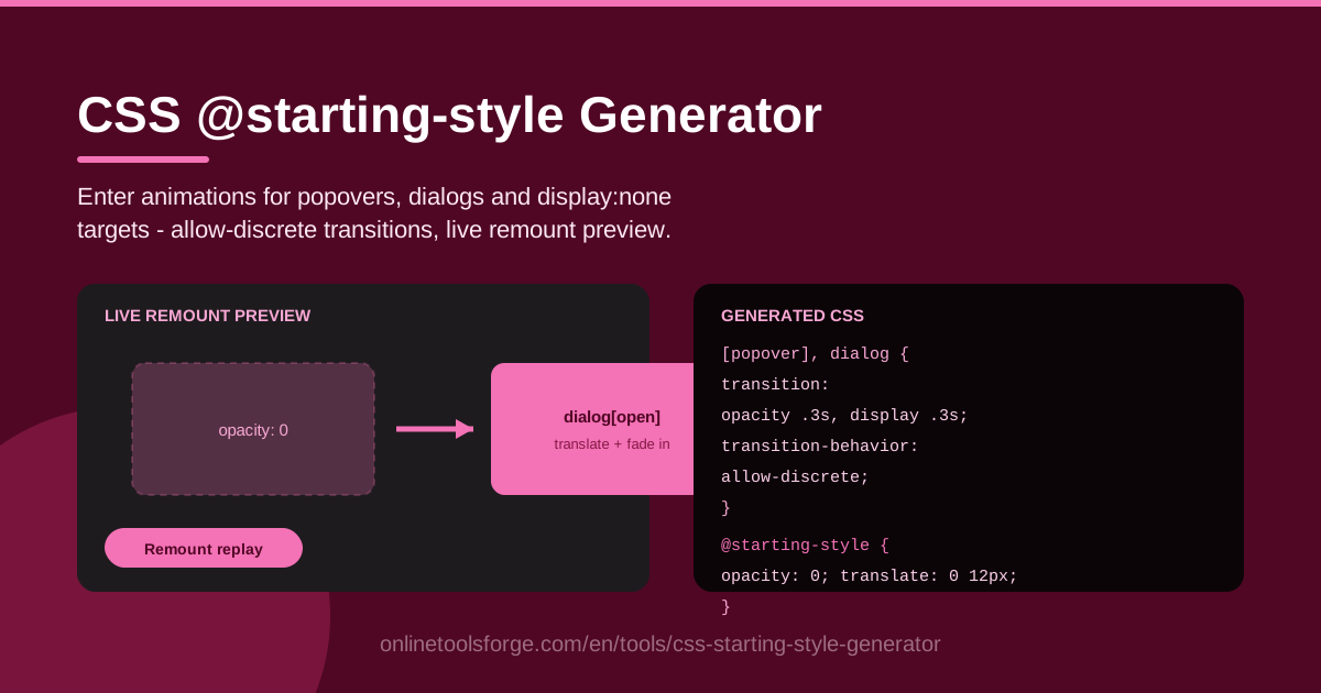
Table of Contents
Every interface has moments where something appears on screen: a menu drops down, a dialog rises, a toast slides into the corner. When those elements pop into existence with no transition, the interface feels abrupt; when they fade and settle into place, it feels polished. For years, animating that entrance in pure CSS was nearly impossible, because browsers never transition from a state that did not exist yet. The @starting-style rule fixes exactly that, and the CSS @starting-style Generator at Online Tools Forge builds those enter animations for you, visually, in your browser.
The tool generates copy-paste CSS for animating elements as they appear — popover targets, dialog targets, or anything toggled out of display:none. You configure the starting opacity and transform, choose durations and easings, and the generator emits the supporting declarations that make display transitions genuinely animate, including transition-behavior: allow-discrete. A live remount preview replays the entrance on demand so you can judge the motion before it ever reaches your codebase.
This guide covers why the tool exists, how to use it step by step, and what @starting-style actually changes under the hood.
Why Use CSS @starting-style Generator?
- Enter animations without JavaScript. Before @starting-style, animating an element's first frame required class-toggling tricks, double requestAnimationFrame calls, or an animation library. Now a few CSS declarations describe the entrance and the browser does the rest.
- It solves the display:none problem. CSS transitions only fire between two rendered states. An element that flips from display:none to display:block never had a "before" frame, so it simply appears. The generator emits transition-behavior: allow-discrete so the display change itself joins the transition.
- Purpose-built for popover and dialog. The native popover and dialog elements are the marquee use cases for @starting-style. Pick your target type and the generated CSS matches the element you are actually animating.
- Visual controls beat hand-written syntax. Dial in starting opacity, starting transform, duration, and easing with immediate feedback instead of memorizing rule syntax and hunting for typos.
- A live remount preview. Enter animations only play when an element first appears, so the tool remounts the preview element and lets you replay the entrance as many times as you need.
- Zero dependencies, runs in your browser. Everything happens client-side. Copy the output, paste it into your stylesheet, done.
Key Features
| Feature | What it does |
|---|---|
| Target type selection | Generates styles for popover, dialog, or display:none elements |
| Starting opacity | Sets the first-frame opacity so the element fades in rather than flashing |
| Starting transform | Defines initial translate, scale, or rotate offsets for slide and grow effects |
| Duration control | Tunes how long the enter transition runs |
| Easing selection | Picks the timing curve, from linear to ease-out styles |
| allow-discrete output | Emits transition-behavior: allow-discrete so display transitions animate |
| Live remount preview | Replays the entrance on demand for instant iteration |
| Copy-paste CSS | Clean, dependency-free output ready for your stylesheet |
A few details worth calling out:
- The preview tells the truth. By remounting the target element, each replay starts from a genuine first frame — the same conditions your popover faces the first time a user opens it.
- Only compositor-friendly properties. The generator focuses on opacity and transform, the two properties browsers animate on the GPU without triggering layout.
- Graceful degradation built in. In browsers without @starting-style support, the element simply renders its final state, so the worst case is an instant appearance rather than a broken interface.
How to Use CSS @starting-style Generator
- Pick your target type. Choose popover, dialog, or a display:none element. This determines which selectors the generator produces and how the display transition is handled.
- Set the starting opacity and transform. For a classic entrance, start at opacity 0 with a slight translateY offset; for a growing panel, add a scale just below 1. These are the values the element holds for its very first frame.
- Tune duration and easing. Short and decisive works best for menus — the 150 to 300 millisecond range with an ease-out curve covers most cases, while large dialogs can carry a softer, slightly longer timing.
- Preview with the remount control. Watch the entrance several times, nudging values between replays until the motion feels right rather than decorative.
- Copy the CSS into your project. Paste the generated block into your stylesheet, apply it to the element that opens your popover or dialog, and the animation takes over from there.
Why Enter Animations Needed @starting-style
The display:none transition problem. CSS transitions interpolate between a starting value and an ending value, but both states must be rendered. When you flip an element from display:none to display:block, there is no starting frame to interpolate from — the element goes from not participating in layout to fully laid out in one frame, and every transition on it is skipped. The top layer that hosts popover and dialog elements behaves the same way: it appears in a single frame, so a plain transition property never fires.
How @starting-style defines the first frame. The rule tells the browser: "when this element first becomes rendered, treat its styles as these." An element that starts at opacity 0 inside @starting-style and rests at opacity 1 in its normal state now has a genuine from-to pair, so the browser runs a real transition across those frames.
transition-behavior: allow-discrete makes display transitionable. display is a discrete property — it cannot be interpolated halfway. By default, discrete values flip immediately, which would end the animation before it began. transition-behavior: allow-discrete opts display into the transition list so the browser coordinates the display change with the opacity and transform animation. The generator always emits it for display-based targets because without it, the enter animation silently never plays.
Exit animations still need extra work. @starting-style only describes the first frame of an appearance. Fading an element out requires a transition on its closing state, allow-discrete again so the display flip waits for the fade to finish, and — for strict timing guarantees — the transitionend event or a little JavaScript. Treat exits as a separate task.
Browser support reality. @starting-style shipped in Chromium browsers in 2023, with Safari and Firefox following during 2024, so every current evergreen browser understands it. Older browsers ignore the starting style and render the final state immediately — a graceful fallback, though wrapping the rules in an @supports check is still good hygiene.
Practical Use Cases
Popover menus that fade in
Action menus and filter panels built on the native popover attribute are the canonical use case. Start the menu at opacity 0 with a few pixels of vertical offset, transition it to fully visible over roughly 180 milliseconds, and the menu feels attached to the button that opened it instead of teleporting in.
Dialog modals with slide-up
Confirmations, forms, and settings panels hosted in a dialog benefit from a slide-up entrance: start at opacity 0 and translateY(16px), then ease out to the resting position over 250 milliseconds. The upward motion reads as "coming to the front," which matches the modal's role in the interface.
Toast notifications
Toasts enter when they are injected into the DOM — exactly the "element first becomes rendered" moment @starting-style covers. A quick fade with a small translate from the screen edge makes notifications noticeable without hijacking attention, and because the CSS is declarative, every toast inherits the entrance automatically.
Disclosure reveals and inline panels
Any panel toggled out of display:none — an expandable settings drawer, a mobile nav overlay, an FAQ answer that grows open — can use the same generated pattern. The starting transform direction becomes a design cue: slide down from a header, expand from a button, or scale up from the tap point.
Best Practices
- Respect prefers-reduced-motion. Wrap the animation in a media query that disables or shortens movement for users who have asked for less motion. Entrance animations are polish, never a requirement.
- Animate opacity and transform only. They composite on the GPU without forcing layout or paint. Animating width, height, or top causes jank exactly when your element is busiest — entering.
- Keep durations between 150 and 300 milliseconds. Faster than 150ms reads as a glitch; slower than 300ms starts to feel like waiting. Dialogs can stretch slightly longer; menus should not.
- Pair every entrance with a considered exit. Add a matching transition for the closing direction and include transition-behavior: allow-discrete so the display flip waits its turn.
- Keep the starting state honest. A starting transform should begin near the element's real position. Huge offsets turn an entrance into a slideshow.
- Test with keyboard and touch. Entrances triggered by focus or taps must be as smooth as mouse clicks, and focus should land on visible, fully opaque content.
Ready to give your popovers, dialogs, and toggled panels a proper entrance? Open the CSS @starting-style Generator, dial in your first frame, replay the remount preview until the motion feels right, and copy the CSS straight into your project — no JavaScript required.
Related Tools You Might Like:
- CSS Animation Generator — build keyframe animations for loops, entrances, and attention effects with a visual editor.
- CSS Spinner Generator — create loading spinners and progress indicators as pure CSS output.
- Box Shadow Generator — design layered shadows that give popovers and dialogs real elevation.
Happy animating!
Frequently Asked Questions
Q: Does @starting-style work without any JavaScript? A: Yes. The browser applies the starting styles the moment the element first renders and transitions to its normal styles on its own. JavaScript is only needed to open or close the element itself — for popovers and dialogs that is often a single method call or even pure HTML.
Q: Why does my element still appear instantly instead of animating? A: Three usual culprits. The element needs a transition property in its normal, open state — not only inside @starting-style. If you are toggling display, the transition must include display and your CSS needs transition-behavior: allow-discrete. And the starting values must actually differ from the final values, or there is nothing to animate.
Q: Which browsers support @starting-style today? A: All evergreen browsers — Chromium-based browsers, Safari, and Firefox — support it. Older browsers skip the starting styles and show the final state immediately, so unsupported environments degrade to a simple appearance rather than a broken layout.
Q: Can I animate the closing transition with the same CSS? A: Not from @starting-style alone, since it only defines the first frame of an appearance. Exits need a transition on the closing state plus transition-behavior: allow-discrete so display stays rendered until the fade-out finishes; more complex exit sequences may still use a small amount of JavaScript.