Tailwind to CSS Converter: See the Plain CSS Behind Every Utility Class
Expand Tailwind CSS utility class strings into equivalent plain CSS rules — hover, focus, breakpoints, and dark mode variants decoded into media queries and pseudo-selectors, 100% client-side.
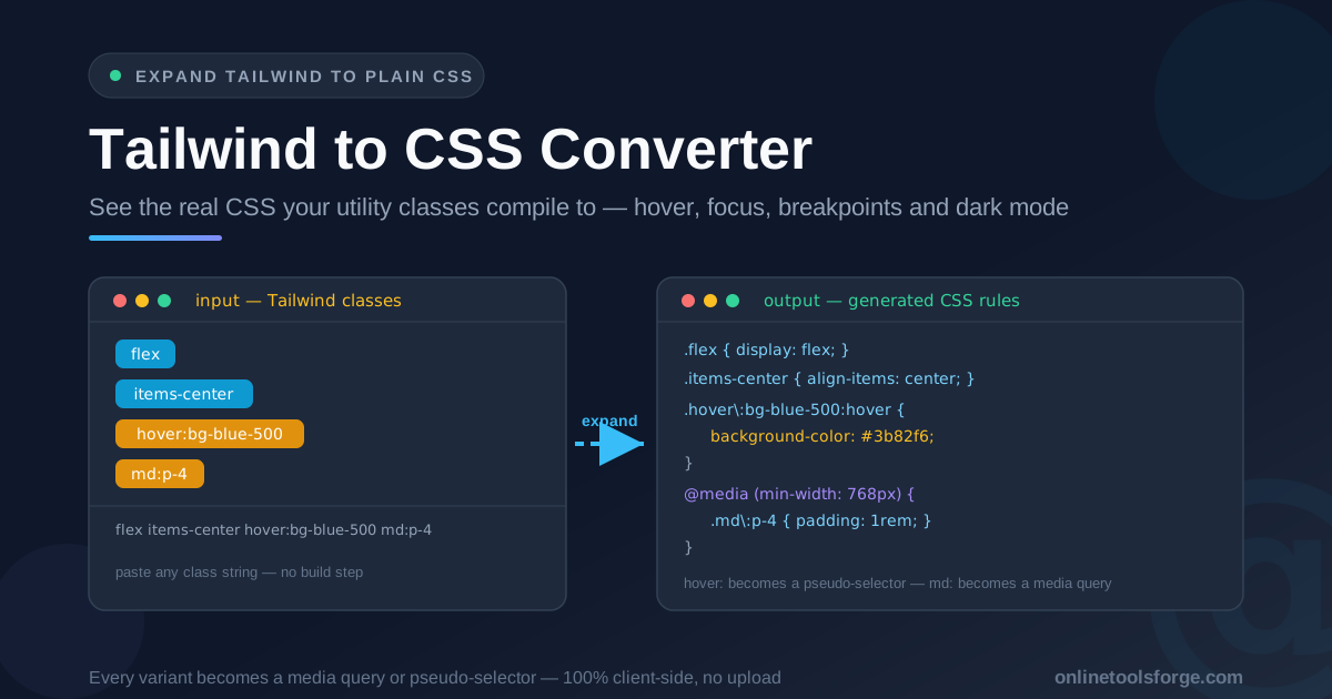
Table of Contents
Tailwind to CSS Converter: See the Plain CSS Behind Every Utility Class
Tailwind lets you style without leaving your markup, but it puts a translation layer between what you write and what the browser applies. When a button refuses to change on hover, or padding vanishes at a breakpoint, the answer is never in the class attribute — it is in the CSS those classes compile to. Debugging Tailwind means knowing what the browser actually receives, and the fastest way to see that is to expand your utilities into the rules they generate. The Tailwind to CSS Converter does exactly that: paste a class string, get back equivalent plain CSS.
The tool expands any Tailwind class list into real CSS rules, right in the browser. Base utilities become ordinary class selectors. Variants are decoded, not guessed: hover: and focus: become pseudo-selectors, md: and other breakpoints become media queries, and dark: resolves to a prefers-color-scheme query. Arbitrary values like w-[37px] land as literal CSS. No install, no config, no build step — and because everything runs 100% client-side, your code never leaves your machine.
Why Use Tailwind to CSS Converter?
-
You see the browser's version of your styles: The class attribute is a wish list; the stylesheet is the contract. Expansion shows the exact declarations the browser evaluates.
-
Variants are decoded, not hand-waved: hover:bg-blue-500 becomes a .hover\:bg-blue-500:hover selector and md:p-4 lands inside @media (min-width: 768px).
-
One class is often several properties: p-4 reads like a single instruction but expands into declarations covering all four sides.
-
No project setup required: No Tailwind CLI, config, or project needed — it works for a Stack Overflow snippet as easily as a production component.
-
It bridges the vocabulary gap: CSS-native colleagues think in selectors, declarations, and media queries. The converter translates Tailwind shorthand into their language instantly.
-
Private by design: Expansion happens entirely in your browser — class strings never leave your machine, and no account is required.
Key Features
| Feature | What it does |
|---|---|
| Utility expansion | Turns any Tailwind class string into the equivalent plain CSS rules |
| Pseudo-class variants | hover: and focus: compile to :hover and :focus selectors |
| Breakpoint variants | sm: through 2xl: map to their min-width media queries |
| Dark mode decoding | dark: utilities resolve to prefers-color-scheme: dark media queries |
| Arbitrary values | Bracketed values like w-[37px] become literal CSS |
| Live output | Rules update as you type, with one-click copy and a sample class string |
| 100% client-side | All expansion happens in your browser — no uploads, no account |
-
Variant decoding is the core value: you see the selector and the wrapping condition, so each rule reads the way the browser reads it.
-
Live output makes exploration cheap: append focus: or change sm: to lg: and the CSS re-renders instantly.
How to Use
- Open the Tailwind to CSS Converter. It loads instantly with no signup; a sample class string shows the output format.
- Paste the full class string. Copy the whole className or class attribute, base utilities and variants together.
- Read the base rules first — unprefixed utilities produce ordinary class selectors.
- Inspect the variant rules — confirm each pseudo-selector and media query applies when you expect.
- Copy the generated CSS into a doc comment, bug report, migration file, or plain-CSS prototype.
What Utilities Compile To
The most common misconception about Tailwind is that one class equals one property. In reality, a class may set one property, several properties, or the same property across several states. p-4 reads as "padding 4" but expands into four declarations — padding-top, padding-right, padding-bottom, padding-left. One class, four sides. text-lg sets both font-size and line-height — override one half later, and the expansion explains why the other half still applies.
Variants transform the selector rather than the declaration: a hovered background becomes a class with a pseudo-class attached, and a breakpoint variant wraps its rule in a media query. The rule exists below the breakpoint too — it simply never matches. Dark mode follows the same pattern, with dark:bg-slate-900 resolving to a prefers-color-scheme: dark query. Arbitrary values are simplest: w-[37px] produces width: 37px, emitted exactly as written.
One string, fully expanded:
/* class="flex items-center hover:bg-blue-500 md:p-4" */
.flex {
  display: flex;
}

.items-center {
  align-items: center;
}

.hover\:bg-blue-500:hover {
  background-color: #3b82f6;
}

@media (min-width: 768px) {
  .md\:p-4 {
    padding-top: 1rem;
    padding-right: 1rem;
    padding-bottom: 1rem;
    padding-left: 1rem;
  }
}
This expansion also answers specificity surprises. Every utility is a single class selector, so ties are everywhere, and the winner is decided by source order in the compiled stylesheet — not by class order in your attribute. If p-4 and px-6 both apply and the horizontal padding wins here but not there, the expanded rules make the tie visible. "Mysterious" behavior becomes a stylesheet-ordering question with a checkable answer.
Practical Use Cases
Explaining Tailwind to CSS-native developers
Designers, backend developers, and new hires all read plain CSS fluently. Instead of defending Tailwind with analogies, expand the classes and hand over the rules. The conversation shifts from "trust the framework" to "here is exactly what your button does on hover."
Debugging specificity conflicts
The classic Tailwind bug is two utilities fighting for one property, the loser depending on where the element sits in the cascade. The expanded output shows the competing declarations side by side: which rules tie, which wins on source order, and which variant never matches.
Documenting design tokens and components
Generated CSS is precise and meaningful to everyone — include it in a README or pull request description, and the component's behavior is documented in the language every web developer shares.
Migrating off Tailwind
The first hard step of leaving a utility-first framework is extracting the CSS that must survive. The converter produces the plain rules your markup compiles to — the skeleton of the migrated stylesheet. Add a px-to-rem pass, and migration becomes mechanical translation.
Best Practices
- Paste the full class string, not one class at a time: interactions between utilities only appear when everything is expanded together.
- Check the breakpoint variants deliberately: confirm each sm:, md:, and lg: rule wraps the media query you expect.
- Read base rules before variant rules: know what the element does at rest first; the variant layers then read as small deltas.
- Keep the source clean before you convert: run class strings through the Tailwind Class Sorter first.
- Convert units when porting rules: output may mix px and rem; the CSS Unit Converter normalizes values.
- Keep the generated CSS with the artifact: paste it into component docs, the bug ticket, or the migration commit.
Turn Any Class String Into CSS Today
Do not wonder what a utility compiles to or spin up a build to find out. Open the Tailwind to CSS Converter, paste the class string you are arguing about, and read the exact rules the browser receives — free, instant, and entirely in your browser.
Related Tools You Might Like:
- Tailwind Class Sorter — put every utility class in canonical order before you convert
- CSS Unit Converter — convert between px, rem, em, and other CSS units
- CSS to JS Object Converter — turn CSS declarations into React style objects
Happy converting!
Frequently Asked Questions
Q: Is the generated CSS identical to what the Tailwind CLI produces?
A: The selectors, property values, and media queries match what Tailwind resolves for each utility. A production build additionally deduplicates and orders rules for the cascade, so treat the generated CSS as an accurate expansion, not a replacement for the build pipeline.
Q: Are my class strings uploaded to a server?
A: No. The converter runs 100% client-side — nothing is uploaded and no account is required. Class strings never leave your machine.
Q: Which variants does the converter support?
A: The common pseudo-class variants such as hover: and focus:, responsive breakpoints from sm: through 2xl:, and condition variants like dark:. Stacked variants such as md:hover: combine into a media query wrapping a pseudo-selector.
Q: Why does the generated selector contain a backslash?
A: The backslash is CSS escaping, not a typo. Class names cannot contain a literal colon, so the browser matches hover:bg-blue-500 through the escaped selector .hover\:bg-blue-500. Copy it as-is and it targets the same element Tailwind does.
Q: Can I use the output in a real project?
A: Yes, as a starting point — for prototypes, email templates, or extracting a component into a plain stylesheet. For an app that keeps evolving, staying on utilities is usually the better choice; the converter is a bridge, not a mandate to leave.