CSS Anchor Positioning Generator: Build Popovers and Tooltips in Pure CSS
The CSS Anchor Positioning Generator builds anchor-name, position-area and position-try fallback rules with a live preview, so your popovers and tooltips stick to their triggers without a single line of JavaScript.
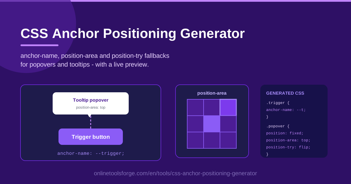
Table of Contents
Attaching a tooltip or popover to its trigger has always been a deceptively hard frontend problem. You place the element perfectly, the user resizes the window, and suddenly it overflows the viewport or gets clipped at the edge. For years the standard answer was a JavaScript positioning library. The CSS Anchor Positioning API changes that by letting the browser handle placement natively — and the CSS Anchor Positioning Generator makes the new syntax practical before you have memorized a single property.
The tool lets you define an anchor (the trigger element) and a positioned element (your popover or tooltip), pick a position-area from a visual grid, add position-try fallbacks for every viewport edge, and tune the gap in pixels. Each change instantly updates the live preview and the Generated CSS panel, where a Copy CSS button hands you production-ready rules.
In this guide you will learn how to use the generator step by step, how the API underneath actually works, and where anchored positioning earns its place in real projects.
Why Use CSS Anchor Positioning Generator?
- No JavaScript positioning libraries. The generated rules are pure CSS. You can drop positioning scripts, their bundle weight, and their scroll-and-resize event listeners from your project entirely.
- Viewport fallbacks handled for you. position-try fallback chains tell the browser to flip the popover to the opposite side automatically when the preferred placement would clip — logic you would otherwise write and test by hand.
- Visual configuration, zero syntax errors. Choosing a spot on a grid is faster and safer than recalling the many-branched position-area grammar.
- Copy-ready output. The Generated CSS panel produces a clean, formatted rule pair you can paste straight into your stylesheet.
- Live preview while you tune. Adjust gap, area, and fallbacks and watch the tooltip move instantly, so placement decisions come from what you see, not what you imagine.
- A gentle on-ramp to a new API. Every control maps to one CSS declaration, so the tool doubles as an interactive reference for anchor-name, position-area, and position-try.
Key Features
| Feature | What it does |
|---|---|
| Anchor (trigger) selector | Declares an anchor-name on the element your popover attaches to |
| Positioned (popover) selector | Styles the tooltip or popover and binds it back to the anchor |
| position-area generation | Places the popover in one of the grid zones around the trigger |
| position-try fallbacks | Builds an ordered fallback list so the browser flips placement when space runs out |
| Gap / margin in px | Controls the distance between trigger and popover with pixel precision |
| Generated CSS panel | Shows the finished rules with a one-click Copy CSS button |
| Live preview | Renders the anchor-popover pair so you can verify placement immediately |
Three details worth knowing:
- The fallback list is ordered: the browser tries each position-try option in sequence and applies the first one that fits inside the viewport.
- Gap values are emitted in px so output stays predictable across zoom levels and font settings.
- Everything is plain CSS — no build step, no runtime, nothing to install.
How to Use CSS Anchor Positioning Generator
- Define the anchor. Enter the selector of your trigger element, such as a button or icon link. The generator writes an anchor-name declaration like --tooltip-anchor onto it.
- Define the positioned element. Enter the selector of your popover or tooltip. The tool generates position: absolute plus an anchor binding that ties it to the trigger.
- Pick a position-area. Choose where the popover should sit — top, bottom, left, right, or a corner — and the generator emits the matching position-area value.
- Add fallbacks and spacing. Enable position-try fallbacks for the opposite and side placements, and set the gap in px so the popover never crowds its trigger.
- Copy the CSS. Confirm the live preview looks right, then press Copy CSS in the Generated CSS panel and paste the rules into your stylesheet.
How the Anchor Positioning API Works
The API rests on a handful of properties that cooperate:
- anchor-name. The trigger declares itself an anchor: .trigger { anchor-name: --my-anchor; }. The two-dash style is deliberate — anchor names live in the same namespace as custom properties, keeping them consistent and collision-aware.
- Implicit versus explicit anchor. By default, a positioned element resolves to its nearest preceding element as an implicit anchor, which suits simple tooltip markup where the trigger sits right before the popover. An explicit binding names a specific anchor via a declaration such as position-anchor, and that is what the generator emits, so the relationship survives markup reshuffles.
- position-area grid semantics. position-area divides the space around the anchor into a three-by-three grid — top, center, bottom crossed with left, center, right — plus spanning values such as span-top. A value like top span-right places the popover above the anchor, aligned to its right edge. The tool's visual picker mirrors this grid one-to-one.
- position-try fallback ordering. position-try-fallbacks lists alternatives such as flip-block and flip-inline. The browser evaluates the preferred position-area first; if the popover would overflow, it walks the list in order and applies the first placement that fits. That fallback walk is precisely why anchored popovers never get clipped.
- Browser support reality check. Support is solid across Chromium browsers — Chrome and Edge from version 125 onward — while Firefox and Safari are still catching up. Treat the API as progressive enhancement: ship the generated rules, and gate them with @supports so older engines fall back to your legacy tooltip styles gracefully.
Practical Use Cases
Tooltips That Never Overflow the Viewport
The classic pain: an icon button near the screen edge pushes its tooltip off-screen. With position-area: top and a flip-block fallback, the browser silently flips the tooltip below the trigger when there is no room above. Add a comfortable px gap and the tooltip stays readable everywhere, from ultrawide monitors to narrow phones.
Dropdown Menus Without a Positioning Library
Navigation dropdowns are the second most common anchor use case. Anchor the menu panel to its button with block-end or bottom span-right, add inline fallbacks for the viewport's right edge, and delete the positioning script. Because placement is driven purely by CSS, the menu also opens faster — no layout recalculation in JavaScript after paint.
Form Validation Popovers
Rather than a red border plus an error summary somewhere far away, anchor a small popover to the invalid field. The message tracks the field through reflows and keyboard scrolling, and fallbacks keep it visible even when the field sits at the bottom of the viewport.
Tour and Onboarding Overlays
Product tours and empty-state hints usually point at specific controls. Anchoring each hint card to its target keeps the pointer relationship intact through resizing and content changes, without a tour library recalculating coordinates on every scroll event.
Best Practices
- Always add position-try fallbacks. A preferred placement alone will eventually clip; fallbacks are what make anchored elements genuinely viewport-safe.
- Check caniuse before you rely on it. Support is strongest in Chromium; plan a non-anchored fallback for engines without the API.
- Keep the gap consistent. Reuse one px gap across every popover in your design system so spacing feels intentional.
- Pair with the native popover attribute. The popover attribute handles visibility, light dismiss, and top-layer rendering; anchor positioning handles where it appears.
- Gate rules with @supports. Wrap anchored styles in a feature query so older browsers revert to legacy styles cleanly.
- Name anchors semantically. --nav-menu-anchor communicates far more than --a1 and prevents collisions in larger codebases.
Ready to drop a positioning library from your bundle? Open the CSS Anchor Positioning Generator, configure your anchor and popover, and copy production-ready CSS in under a minute.
Related Tools You Might Like:
- Flexbox Generator — build flexible one-dimensional layouts
- Bento Grid Generator — compose modern bento-style grids
- Box Shadow Generator — craft layered shadows for popovers and cards
Happy positioning!
Frequently Asked Questions
Q: Which browsers support CSS anchor positioning? A: Chromium-based browsers such as Chrome and Edge (version 125 and later) fully support the core properties, while Firefox and Safari are still rolling out support. Treat anchor positioning as progressive enhancement and keep a fallback path behind @supports.
Q: Do I still need a JavaScript positioning library like Popper? A: Not in browsers that support the API. The generated position-area and position-try rules replace what those libraries do, at zero runtime cost. Keep a library-based fallback only if you must serve engines without anchor positioning.
Q: What is the difference between position-area and position-try-fallbacks? A: position-area sets the preferred placement within the grid around the anchor. position-try-fallbacks lists alternative placements the browser tries in order when the preferred one would overflow the viewport.
Q: Can the generated CSS work with the native popover attribute? A: Yes, and that pairing is recommended. The popover attribute manages visibility, dismissal, and top-layer rendering, while anchor positioning controls placement — together they cover what used to require a library.