CSS Logical Properties Converter: Write RTL-Safe CSS Without the Guesswork
Learn how the free CSS Logical Properties Converter maps margin-top, padding-left, and border-right to margin-block-start, padding-inline-start, and border-inline-end for LTR, RTL, and vertical writing modes. 100% client-side.
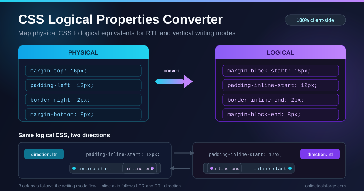
Table of Contents
CSS Logical Properties Converter: Write RTL-Safe CSS Without the Guesswork
If you have ever shipped a layout that looked flawless in English and fell apart the moment an Arabic or Hebrew reader opened it, you already know the culprit: physical properties. One innocent margin-left: 16px assumes that "left" is always the starting edge of content, and for the hundreds of millions of people who read right to left, it simply is not. Modern CSS solved this years ago with logical properties, and the free CSS Logical Properties Converter makes the migration painless.
Logical properties describe spacing relative to the flow of text instead of the physical screen. The block axis follows the writing flow, while the inline axis follows the reading direction. Because the correct mapping depends on both writing-mode and direction, converting margin-top to margin-block-start by hand is error-prone. This tool performs the mapping instantly, with 100% of the work happening in your browser.
Why Use CSS Logical Properties Converter?
- Two-way conversion. Flip between "to logical" and "to physical" modes, so you can modernize legacy stylesheets or translate a logical design back into classic syntax while debugging.
- Writing-mode aware. Choose horizontal-tb, vertical-lr, or vertical-rl, and each side is mapped against the correct axis, exactly as the browser would.
- Direction aware. Select LTR or RTL and watch margin-left become margin-inline-start in English but margin-inline-end in an Arabic context — the most common source of internationalization bugs.
- Covers margin, padding, and border. The three property families where directional assumptions break layouts most often, including shorthand forms.
- Private and instant. Everything runs client-side; your CSS never leaves the tab and results appear as you type.
Key Features
| Feature | What it delivers |
|---|---|
| Two-way mode switch | Physical to logical, or logical back to physical |
| Writing-mode selector | horizontal-tb, vertical-lr, and vertical-rl |
| Direction selector | LTR and RTL flip start and end on the inline axis |
| Full property coverage | margin, padding, and border in all four physical sides plus shorthands |
| Live output | Paste declarations, copy the converted stylesheet — no server round-trip |
Worth noting:
- You can paste a whole rule body or a single line such as padding-left: 12px; and get an exact replacement.
- Unrecognized declarations pass through untouched, and a warning counter shows how many declarations shifted meaning.
How to Use
- Open the tool. Navigate to the CSS Logical Properties Converter — it works fully in the browser.
- Paste your CSS. Drop in physical declarations such as margin-top: 16px; padding-left: 12px; border-right: 2px solid;.
- Pick the direction. Keep "to logical" for modernizing code, or switch to "to physical" when translating back to classic syntax.
- Set the context. Choose the writing mode (usually horizontal-tb) and the direction (LTR for English, RTL for Arabic and Hebrew). These two settings drive the entire mapping.
- Copy the result. Take the converted declarations straight back into your stylesheet.
Physical vs Logical Axes
The block axis follows the writing flow. In horizontal-tb (the default), blocks stack top to bottom, so block-start is the top and block-end is the bottom. In vertical-rl, text flows in vertical columns starting from the right, so the block axis becomes horizontal and block-start is the right edge.
The inline axis follows the reading direction. In LTR text, inline-start is the left edge. In RTL text the axis flips: inline-start becomes the right edge. The block axis does not care about direction at all — that separation is exactly what makes logical properties direction-safe.
Under the default horizontal-tb LTR context, the mapping is:
| Physical | Logical |
|---|---|
| margin-top | margin-block-start |
| margin-bottom | margin-block-end |
| margin-left | margin-inline-start |
| margin-right | margin-inline-end |
The identical pattern applies to padding (padding-top becomes padding-block-start) and borders (border-left-width becomes border-inline-start-width).
What flips under RTL. Only the inline side changes: margin-inline-start resolves to the right edge, so one declaration serves both English and Arabic layouts. margin-block-start is untouched — top stays top.
What flips under vertical-rl. The axes rotate. block-start moves from top to right, and inline-start moves from left to top. A padding-block-start: 24px that added space above a heading in horizontal text now adds space to its right in vertical columns — precisely what Japanese and Traditional Chinese typography expects.
Browser support reality check. Margin, padding, and border logical properties have shipped in every major browser since 2021, with complete longhand coverage by early 2023. For modern audiences you can use them in production with no polyfill; keep a physical fallback only for very old enterprise browsers.
A before-and-after example for an Arabic layout:
/* Before — breaks in RTL contexts */
.card {
  margin-top: 24px;
  padding-left: 16px;
  border-right: 3px solid #6366f1;
  text-align: left;
}
After converting with direction set to RTL:
/* After — correct in both LTR and RTL */
.card {
  margin-block-start: 24px;
  padding-inline-start: 16px;
  border-inline-end: 3px solid #6366f1;
  text-align: start;
}
In English the card renders identically to before. In Arabic the accent border and padding automatically move to the right side, with no duplicated rules.
Practical Use Cases
Internationalizing Existing Components
Most codebases are full of physical properties written without RTL in mind. Paste a component into the converter, review the warnings, and ship a direction-neutral version. A ten-minute audit per component removes an entire class of internationalization bugs.
Arabic, Hebrew, and Thai Mixed Interfaces
Real products rarely contain one script. An Arabic dashboard can embed English brand names or Thai product titles. Because logical properties bind spacing to flow rather than a fixed side, mixed-direction content lines up without per-language stylesheets — Thai, which flows LTR, mixes cleanly with RTL neighbors in the same flex or grid container.
Vertical Text Designs
Book covers, magazine spreads, and East Asian typography often use writing-mode: vertical-rl. Instead of mentally rotating every padding-left, set the writing mode in the converter and get the correct block and inline values immediately.
Future-Proofing New Code
Components written with logical properties work in every context they will meet: new locales, sidebars that swap sides, and vertical or print variants. Building the habit now beats retrofitting direction support later.
Best Practices
- Adopt logical properties in all new code. Treat margin-left in a fresh component as a code smell; prefer margin-inline-start by default.
- Test both directions. Flip dir="rtl" on a wrapper during development; the warning counter tells you where to look.
- Watch text-align too. text-align: left has the same RTL problem as margin-left; use text-align: start and text-align: end.
- Convert one property family at a time. Margin, then padding, then borders keeps diffs reviewable.
- Keep shorthands consistent. Mixing physical and logical shorthands in one rule creates order-of-application surprises.
Start Converting Your CSS Today
Direction bugs are silent in English-only testing and embarrassing in production. Open the CSS Logical Properties Converter, paste a component, flip the direction selector, and see how much of your stylesheet is direction-sensitive. It is free, runs entirely in your browser, and takes less time than reading this paragraph twice.
Related Tools You Might Like:
- CSS Unit Converter — convert px, rem, em, pt, and more
- Tailwind Class Sorter — keep utility classes readable and consistent
- CSS Selector Tester — verify selectors against sample HTML instantly
Happy converting!
Frequently Asked Questions
Q: What is the difference between physical and logical CSS properties?
A: Physical properties such as margin-left refer to fixed screen edges, while logical properties such as margin-inline-start refer to the start of the text flow. In LTR layouts the two coincide; in RTL or vertical writing modes they diverge, and only the logical version stays correct.
Q: Does converting margin-left change how my English layout looks?
A: No. In a default horizontal-tb LTR context, margin-inline-start resolves to exactly the same edge as margin-left, so your design renders pixel-for-pixel identically. The benefit appears the moment the same code is viewed in an RTL context.
Q: Do logical properties work in all browsers?
A: Yes, for practical purposes. Every major browser has supported them since 2021, with complete longhand coverage by early 2023, so you can ship them in production without polyfills for modern audiences.
Q: Is my CSS sent to a server?
A: Never. The converter runs 100% client-side in your browser tab, so nothing you paste is uploaded, stored, or logged anywhere.