CSS Mesh Gradient Generator Guide: Build Multi-Point Mesh Backgrounds in Pure CSS
Learn how to build multi-point mesh-style CSS gradients with the CSS Mesh Gradient Generator. Color point placement, live preview, modern gradient interpolation, and copy-paste background code explained step by step.
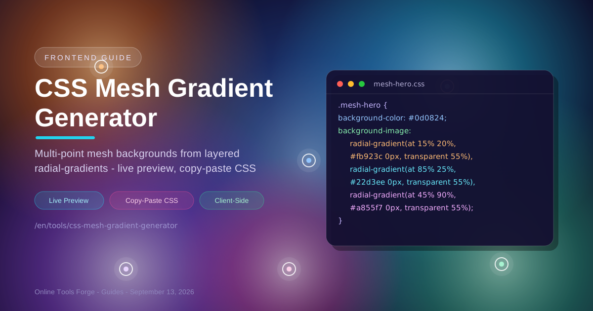
Table of Contents
CSS Mesh Gradient Generator Guide: Build Multi-Point Mesh Backgrounds in Pure CSS
Browse any modern product landing page and you will spot the mesh gradient look: soft pools of orange melting into cyan, violet bleeding into emerald, blended so smoothly the colors seem to float. That aesthetic dominates hero sections because it feels premium and dimensional at once. What many developers miss is that it needs no design export and no WebGL shader. The CSS Mesh Gradient Generator builds that exact look visually in your browser and hands you production-ready CSS when you are done.
A mesh-style CSS gradient is just several radial-gradients stacked as layers on a single background property, each fading from a solid color into transparency. No SVG, no canvas, no runtime JavaScript — the browser paints everything natively. You place color points, watch the preview update live, and copy the finished background code in one click.
This guide covers the workflow, how layered radials fake a true mesh, and where a PNG export still makes sense.
Why Use CSS Mesh Gradient Generator?
Hand-writing multi-point gradients means juggling coordinates, hex values, commas, and layer order simultaneously. A visual generator removes that friction:
- The hero-section aesthetic, without image files. CSS mesh backgrounds scale to any viewport and add zero raster bytes to your page weight.
- Visual color point placement. Instead of guessing where at 15% 20% puts your orange glow, you drag points on a canvas and watch the blend respond.
- Instant live preview. Every change re-renders the full mesh in real time, replacing the save-and-refresh cycle.
- Copy-paste background code. The tool emits a clean, valid background declaration you can paste into any stylesheet or inline style. No missing commas, no unbalanced parentheses.
- Modern gradient interpolation. The output leans on modern CSS gradient interpolation, so bright-to-bright transitions stay vivid instead of collapsing into muddy gray.
- 100% client-side and free. Everything runs in your browser. No account, no uploads, no telemetry about your palette.
Key Features
The tool is deliberately focused: each feature maps directly to the CSS it produces.
| Feature | Description |
|---|---|
| Color point placement | Drag points anywhere on the canvas; each becomes one radial-gradient layer at those coordinates. |
| Per-point color picker | Pick each hue with a native picker or hex input. |
| Live mesh preview | A full-size preview re-renders on every change before you copy. |
| Copy-paste background code | One click copies a ready-to-use background declaration: base color plus the radial stack. |
| Modern interpolation | Output relies on current CSS gradient behavior, keeping transitions clean and saturated. |
| Fully client-side | All rendering and code generation happen locally, making the tool instant and private. |
Two details are worth highlighting. The generated code is intentionally minimal — one selector-ready block for any stack — and layer order in the output matches your point order, which shapes how overlaps blend.
How to Use
Going from blank canvas to shipped CSS takes about a minute.
- Open the tool. Head to the CSS Mesh Gradient Generator. You land on a live preview with a sensible default palette.
- Add color points. Start from the defaults or add points for each hue. Three to five points is the sweet spot.
- Place the points. Drag each to where its color should glow. Corners anchor the composition; a central point adds depth.
- Refine colors and balance. Nudge positions until no single hue dominates awkwardly. The preview updates after every change, so trust your eyes.
- Copy the CSS and ship it. Paste the background block into your stylesheet or component. The code is self-contained.
Faking Mesh With Layered Radials
A true mesh gradient defines a grid of color points and interpolates bilinearly between every cell. Plain CSS cannot express that; genuine mesh rendering requires WebGL or canvas pixel work.
CSS fakes the effect with an optical trick: stack several radial gradients that each fade from a solid color into full transparency, and let your eye do the interpolation where they overlap. Each radial acts like a soft spotlight; intersections read as smooth blends. The generated code looks like this:
.mesh-hero {
  background-color: #0d0824; /* base fills every gap between blobs */
  background-image:
    radial-gradient(at 15% 20%, /* point 1: top-left glow */ #fb923c 0px, transparent 55%),
    /* solid center, fades to nothing */
    radial-gradient(at 85% 25%, /* point 2: top-right glow */ #22d3ee 0px, transparent 55%),
    radial-gradient(at 45% 90%, /* point 3: bottom glow */ #a855f7 0px, transparent 55%);
}
Three details make or break the illusion:
- Transparent falloff. Each gradient ends at transparent about halfway across the canvas; modern browsers interpolate to transparency in premultiplied alpha, so the fade stays clean.
- The background-color base. Wherever every layer has faded out, the base shows through. Pick a deep value related to your palette to quietly unify the blobs.
- Blend ordering. CSS paints the first listed layer on top, so put your most saturated color first and let softer hues sit underneath. Reordering layers changes every intersection.
On performance: three to six radials is cheap. Gradients paint once per layout and cost nothing per frame while static. A dozen layers usually render fine; fifteen-plus on a full-screen animated element makes paint cost real. Banding is the other limit: very wide, low-contrast fades on large monitors can show subtle stripes.
Export a PNG instead when you need pixel-exact blending, dithering to kill banding, complexity beyond a handful of radials, or identical rendering in older engines. Otherwise, live CSS wins on weight, sharpness, and maintainability.
Practical Use Cases
Mesh backgrounds earn their keep anywhere you want atmosphere without imagery.
Hero Section Backgrounds
The classic home. A full-bleed mesh behind your headline and call to action signals a modern product. Keep the strongest glow near the headline with a dark base so text passes contrast checks.
Card Headers and Feature Blocks
Shrink the technique into a banner strip atop a pricing card or feature tile. Two or three points with tighter falloffs give each card its own identity while a shared base color keeps the set cohesive.
Empty States and Loading Screens
Empty dashboards and skeleton screens are usually gray voids. A subdued mesh — low-opacity points, muted hues — turns a dead end into a branded moment.
Login and Signup Pages
Auth screens need calm, focused backdrops. A slow, cool-toned mesh behind a centered form looks polished without distracting from the task.
Best Practices
A few habits keep meshes professional and fast:
- Keep 3 to 5 color points. Beyond that, overlaps compete and the blend turns to soup. Fewer, well-placed points read as intentional.
- Check contrast for overlaid text. Verify at least 4.5:1 contrast for body text against the brightest glow behind it, and add a scrim if a color fights your copy.
- Prefer transforms for animation. Animate the whole gradient layer with transform or opacity on a pseudo-element, which runs on the compositor. Animating background positions forces repaints every frame.
- Anchor points off the canvas. Pushing one or two points past the edge creates asymmetric, organic flow.
- Stay in one temperature family. Meshes look richest with analogous hues or a deliberate warm-versus-cool split. Random hue soup looks amateur.
- Test across breakpoints. Percentage-based points stretch with the viewport, and blobs that look airy on desktop can overwhelm a narrow phone screen.
Start Building Mesh Backgrounds Today
Mesh gradients used to be reserved for teams with design software and image export pipelines. With the CSS Mesh Gradient Generator they are a sixty-second, zero-dependency technique: place color points, watch the preview, and paste the CSS wherever it needs to shine.
Open the CSS Mesh Gradient Generator and give your next hero section the glow it deserves.
Related Tools You Might Like:
- Gradient Generator — Build classic linear and radial gradients with up to ten color stops and precise angle control.
- Border Radius Generator — Round the containers that hold your mesh backgrounds, from subtle cards to full blob shapes.
- Graph Paper Generator — Create printable grid paper for sketching layouts before you code them.
Happy mesh gradient building!
Frequently Asked Questions
Q: Do mesh-style CSS gradients work in all browsers?
A: Layered radial-gradients are supported by every browser of the past decade. Modern gradient interpolation — which keeps bright hues from turning muddy mid-blend — is newest in current evergreen browsers. Older engines render the same structure with slightly less vivid transitions.
Q: Is a CSS mesh gradient slower than a background image?
A: Usually the opposite. The gradient is a few hundred bytes painted natively by the browser, while an equivalent PNG can weigh hundreds of kilobytes. Just avoid animating gradient properties directly.
Q: Can I animate a mesh gradient smoothly?
A: Yes. Put the gradient on a pseudo-element or child layer and animate transform or opacity, which browsers handle on the compositor at full frame rate. Animating background-position or color stops triggers repaints and stutters on weaker devices.
Q: Does the tool upload my colors anywhere?
A: No. The generator runs entirely client-side. Nothing you place, preview, or copy is transmitted to any server.