Gantt Chart Generator: Build Clear Project Timelines in Your Browser
Create project Gantt charts in minutes with Gantt Chart Generator — add task rows with dates and progress, then export crisp SVG or PNG timelines straight from your browser.
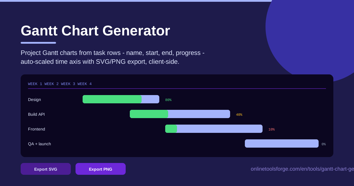
Table of Contents
A task list tells you what needs doing; a Gantt chart tells you when, for how long, and how far along you are. Gantt Chart Generator is a free gantt chart maker online that turns simple task rows — a name, a start date, an end date, and a progress percent — into a clean project timeline with an auto-scaled time axis. When the chart looks right, export it as SVG for documents or PNG for chat and slides. Nothing to install, nothing to sign up for.
Most planning tools sit at two extremes: heavyweight suites with accounts, licenses, and a week of onboarding, or spreadsheets that technically hold dates but never actually show them. This tool lives in the useful middle — no accounts, no cloud sync, no interface to learn beyond typing your tasks, because everything runs client-side in your browser.
This guide covers what the tool does, how to build your first chart in five steps, and how to read a Gantt at a glance.
Why Use Gantt Chart Generator?
- No signup and no cost. Open the page and start adding tasks. No account, no trial that expires, no paywall between you and your finished chart.
- Instant SVG and PNG export. One click gives you a vector SVG that stays sharp in documents and print, or a PNG that drops straight into chat, email, and slide decks.
- Runs entirely client-side. Task names, dates, and progress never leave your browser — safe for confidential client work and internal roadmaps.
- Auto-scaled time axis. You never set scales manually. The chart stretches or compresses to fit the earliest start and latest end date across all tasks.
- Progress built into every bar. Each bar fills proportionally to its progress percent, so status is visible at a glance without reading numbers.
- Fast enough to iterate. Change a date and the chart redraws instantly. Planning tools only get used when they respond quickly, and this one does.
Key Features
| Feature | What it does |
|---|---|
| Task rows | Add each task with a name, start date, end date, and progress percent |
| Auto-scaled time axis | The horizontal axis fits every date in your plan automatically |
| Progress bars | Each bar fills proportionally to show how much of the task is done |
| SVG export | Download a scalable vector chart for docs, wikis, and print |
| PNG export | Download a ready-to-share image for chat, email, and slides |
| Client-side rendering | All computation happens in your browser; nothing is uploaded |
A few details worth knowing:
- Editing is immediate — change a date or percent and the matching bar moves or resizes the moment you finish typing.
- The axis recalculates on every change, so adding one long task rescales the whole timeline without manual fiddling.
- SVG output keeps text and bars crisp at any zoom, which matters when the chart ends up in a printed report.
How to Use Gantt Chart Generator
- Add your task rows. One row per task, with a short, specific name like "Design landing page" rather than just "Design". These names label the bars, so keep them scannable.
- Set dates and progress. Enter a start date and end date for each task plus a progress percent from 0 to 100. Finished tasks sit at 100, untouched tasks at 0, and everything else at reality.
- Review the auto-scaled axis. Check the time axis along the top. Because it scales to your data, the whole plan now sits in one coherent window — confirm the span matches what you promised.
- Adjust overlaps. Look for bars that overlap when they should not. If "Frontend" starts before "Build API" ends, the dates are optimistic or the work is genuinely parallel — make that a conscious decision.
- Export SVG or PNG. When the chart matches the plan, export it. SVG for documents and anything you might scale or print; PNG for instant sharing in chat and email.
Reading a Gantt at a Glance
A Gantt compresses a project into one visual grammar. Know what to look for and you can assess an entire plan in seconds.
Bars are durations. Each horizontal bar is one task stretched across the calendar. A long bar is a long task, and long tasks are where projects slip, because a three-week bar hides everything that goes wrong inside it. When one bar towers over the rest, treat it as a prompt to break that task into smaller pieces.
Progress is the inner fill. The filled portion of each bar shows completion. Scan down the chart: a full bar is done, a half bar is mid-flight, and an empty bar whose dates are already past is a red flag. This shorthand spots a stalled project in under a second — something no task list can do.
The auto-scaled axis reveals gaps and crunches. Because the axis stretches to cover every date you entered, empty stretches become visible. A gap between bars is idle time nobody planned; a cluster of bars squeezed into the same week is a crunch the team never agreed to. Gaps are not always bad — deliberate buffer is healthy — but they should be intentional, and the chart makes the difference obvious.
Overlapping bars are dependency warnings. Real work has order: the API exists before the frontend consumes it, paint dries before cabinets go in. When two dependent bars overlap, the timeline is saying either "these can run in parallel" or "someone will be blocked." Every overlap deserves a decision.
When a Gantt beats a todo list — and when it does not. A Gantt shines when work has hard dates, sequential dependencies, or several owners whose efforts interlock. It is overkill for a loose personal backlog; if nothing depends on anything and no date is fixed, a plain list is faster. Use the Gantt for the genuinely scheduled part of the work.
Practical Use Cases
Client Project Kickoff
A five-week website build becomes rows: Design, Content, Build API, Frontend, QA. Walking the client through the exported chart answers the question every client asks — "when will we see something?" — with dates instead of vague promises. Weekly updates take two minutes: bump the percents and re-export.
Content Calendar
Editorial teams can map a month of content as repeating rows: draft, edit, design graphics, schedule and publish. The chart exposes crunch weeks — three pieces hitting edit at once — before the writers feel them, and gaps show exactly when the publishing queue runs dry.
Renovation Schedule
Renovations are dependency machines: demolition before wiring, wiring before drywall, drywall before paint. Enter each trade as a task and conflicts jump out — an electrician finishing Friday while the drywall crew starts Thursday morning is a collision you can fix on the chart before anyone drives to the site.
Sprint Planning Overview
For a two-week sprint, add the major workstreams — Frontend, Backend, QA, Review — with date ranges and expected progress. The chart is not a replacement for your issue tracker's detail; it is the one-screen overview you paste into the sprint channel so everyone sees the shape of the sprint at a glance.
Best Practices
- Keep tasks under two weeks. Any longer bar hides risk. Split "Develop backend" into "Build API endpoints" and "Wire up database" and the chart starts telling the truth.
- Update progress weekly. A Gantt with stale percentages is fiction. Pick a fixed day, bump the percents, re-export, reshare — five minutes, tops.
- Mark dependencies by ordering. Sequence rows in dependency order so readers can trace the chain top to bottom. Even without drawn arrows, ordered rows make the critical path readable.
- Share the PNG, not a screenshot. The export button produces a clean, full-resolution image of the entire chart. Screenshots crop, blur, and cut off the axis. Always export.
- Plan buffer on purpose. If you want slack before a deadline, add an explicit buffer row so it shows on the chart as a decision, not accidental empty space.
- Keep one source of truth. Decide the tool is the plan of record for the schedule and update it there, rather than maintaining a second copy in a spreadsheet.
When your next project needs a timeline, skip the spreadsheet and the heavyweight suite. Open Gantt Chart Generator, type your tasks, and export a chart the whole team can read — this task timeline generator turns five minutes of typing into a plan everyone understands.
Related Tools You Might Like:
- Kanban Board — visualize workflow stages and move tasks through columns as work progresses.
- Pomodoro Timer — execute the plan with focused 25-minute sessions and structured breaks.
- Habit Tracker — build the weekly review habit that keeps any plan alive.
Happy planning!
Frequently Asked Questions
Q: Is Gantt Chart Generator really free? A: Yes. There is no signup, no subscription, and no export limit. Open the tool, build your chart, and download the SVG or PNG at no cost.
Q: Where is my project data stored? A: Nowhere but your browser. The tool runs entirely client-side, so task names, dates, and progress percentages are never uploaded to a server.
Q: Should I export my chart as SVG or PNG? A: Pick SVG when the chart goes into documents, wikis, or anything that may be scaled or printed, because vectors stay sharp at any size. Pick PNG for instant sharing in chat, email, and slide decks.
Q: Can it handle projects spanning many months? A: Yes. The auto-scaled time axis stretches to fit your earliest start and latest end date, so anything from a one-week sprint to a year-long roadmap renders on one coherent chart.