Image to ASCII Converter: Turn Any Photo Into Text Art in Your Browser
The Image to ASCII Converter turns any uploaded image into ASCII or Unicode block art right in your browser, using pixel luminance mapping with output width, character set, and inversion controls.
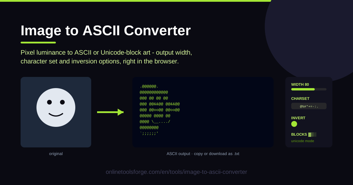
Table of Contents
There is something quietly satisfying about watching a photograph dissolve into a wall of characters and reappear as recognizable art. The Image to ASCII Converter makes that happen in seconds: upload an image, and the tool maps the brightness of every pixel onto a ramp of characters, producing classic ASCII art or denser Unicode block art that still reads as a picture. No software to install, no account to create.
Everything runs locally in your browser. When you pick a file, the page reads the pixels directly, computes a luminance value for each sampled area, and chooses the character whose ink density best matches that brightness. Your image never leaves your machine, which makes the tool a comfortable choice for screenshots, private photos, and anything else you would rather keep to yourself.
This guide explains why a photo to ASCII workflow is worth keeping in your toolkit, walks through every control the tool offers, digs into how luminance mapping actually works, and shares practical use cases and best practices you can apply immediately.
Why Use Image to ASCII Converter?
- Total privacy with zero setup. The conversion happens entirely in your browser, so nothing is uploaded to a server. Open the page, drop in a file, and start converting — no installs, no accounts, no watermarks.
- Output that lives anywhere text does. ASCII art pastes cleanly into READMEs, code comments, chat apps, terminal windows, and plain-text emails. No image hosting, no broken links, no format worries.
- Full control over the final look. Output width, character set, and inversion are three independent dials for tuning the result to dark or light surfaces, wide banners, or narrow comment blocks.
- Two art styles from one tool. The classic ASCII ramp (@%#*+=-:.) delivers beloved retro texture, while Unicode block elements produce smoother, more photo-like shading at the same width.
- Fast, iterative experimentation. Because conversion is instant, you can push the width up and down and swap character sets, comparing drafts in seconds rather than minutes.
- A genuinely useful teaching aid. Watching an image step down into characters is one of the clearest browser-run demonstrations of resolution, quantization, and visual perception.
Key Features
| Feature | What it does |
|---|---|
| Image upload | Load any image file from your device; pixels are read locally in the browser. |
| Luminance mapping | Converts each pixel's perceived brightness into a matching character. |
| Output width control | Sets how many character columns the art uses, which also determines its vertical size. |
| Character set selection | Choose the classic ASCII ramp (@%#*+=-:.) or Unicode block elements for smoother shading. |
| Invert option | Flips the ramp so art reads correctly as dark-on-light or light-on-dark. |
| Copy or download | Grab the text output for immediate pasting, or save it as a file. |
| Fully in-browser | No server round-trips, no accounts, no watermarks. |
A few details worth calling out:
- Output width is measured in character columns, not pixels. Doubling the columns roughly quadruples the character count, because the row count grows with it — width is the single most powerful control in the tool.
- Inversion is not merely cosmetic. It decides whether bright pixels receive dense or sparse characters, which directly changes how the art reads on a dark terminal versus a light page.
- Because the output is plain text, results are typically a few kilobytes — far smaller than the source image, and trivial to embed in code or documentation.
How to Use Image to ASCII Converter
- Upload your image. Select or drop in the photo or graphic you want to convert. Portraits, logos, and high-contrast subjects usually produce strong results on the first try.
- Set the output width. Choose how many character columns you want. Around 60–80 columns suits READMEs and chat messages; wider settings of 100–150 columns or more reveal extra detail for terminal displays.
- Pick a character set. Choose classic ASCII for the retro look and maximum compatibility, or Unicode block elements for smoother gradients in photographs.
- Toggle inversion if needed. If the art will sit on a dark background — a dark-mode editor or terminal — invert it so bright areas use dense characters and the contrast feels right.
- Copy or download the output. Copy the text straight to your clipboard for pasting, or download it as a file to keep alongside your project.
How Luminance Mapping Works
Every pixel starts life as three numbers: red, green, and blue. The first step of the conversion collapses those into a single grayscale brightness value, usually a weighted sum that mirrors how human eyes perceive color — green contributes more than red, and red more than blue. That single number, called luminance, is the only property the converter actually needs.
The character set is really an ordered ramp sorted by ink density, from the lightest character to the darkest. For each sampled area of the image, the tool scales the luminance value into an index on that ramp and outputs the character at that position. A bright sky lands near the sparse end (spaces, dots, periods), while a dark shirt lands near the dense end (@, #, %). One character per brightness level is the entire algorithm at its core.
Output width matters because each column is a vertical strip of source pixels sampled down to a single character. A narrow width throws away fine detail; a wide width preserves more but multiplies the character count. Rows grow proportionally as well, so width controls the resolution and the total size of the art simultaneously.
Block characters differ from classic ASCII in a helpful way. Traditional ASCII glyphs are small symbols whose ink coverage varies unpredictably, while Unicode block elements are designed as solid or partially filled rectangles whose density steps smoothly and predictably. That makes block art the better match for photographs and continuous gradients, while classic ASCII wins on portability and retro charm.
Inversion helps most on dark backgrounds. Art generated for a light page looks wrong on a dark terminal: dense characters read as bright blobs, flipping your subject inside out. Inverting the ramp puts dense characters into bright areas and sparse ones into shadows — exactly what dark surfaces need.
Finally, remember that characters are taller than they are wide — roughly two to one in most monospace fonts. If every source pixel mapped straight to one character, the output would look vertically stretched. The tool compensates by sampling fewer rows than columns, which is why your art appears correctly proportioned. Squint at the output and the shapes should snap into focus — the classic test for any text art.
Practical Use Cases
README Art and Code Comments
A project logo or mascot converted to ASCII can sit at the top of a README with no image hosting required, and it renders anywhere Markdown opens. Developers also tuck small ASCII art into code comments to flag important sections or break up very long files. Because it is plain text, it survives diffs, code review, and copy-paste without breaking anything.
Terminal Startup Banners
Drop ASCII art into your shell's startup script, or into the launch banner of a CLI tool you are building, and every new terminal session greets you with a signature image. This style works best around 60–80 columns wide, and it should be inverted if your terminal theme uses a dark background.
Retro Chat Signatures
A tiny 30–40 character-wide image fits neatly into chat platforms that support monospace code blocks. It is a BBS-era calling card that reliably prompts the question "how did you make that?" Simple, iconic subjects — a hat, a coffee cup, a pet silhouette — work best at this size.
Teaching Pixel Quantization
In a classroom or workshop, the converter is a living slide deck. Ask students to convert the same image at 120, 60, and 30 columns, then compare the results. The exercise shows exactly how reducing samples (resolution) and symbols (quantization levels) discards information — and why the eye still recovers the picture from a few hundred characters.
Best Practices
- Start wide, then narrow down. Review the art at high detail first, then reduce columns until shapes begin to fall apart. The setting just before that breaking point is usually the best fit for your medium.
- High-contrast images convert best. Clean backgrounds and clearly separated subjects map onto characters far more faithfully than busy scenes with complicated lighting or noise.
- Prefer block characters for photos. Solid and partially filled blocks step through gradients smoothly, which suits faces, landscapes, and rounded objects.
- Keep the monospace font when sharing. The output is designed for fixed-width fonts. Paste it into a proportional font and the spacing collapses and the picture distorts immediately.
- Invert for dark backgrounds. Dark terminals and dark-mode editors need the flipped ramp. Generate both versions and pick whichever reads better on its final surface.
- Choose simple, iconic subjects. Faces, logos, and bold silhouettes stay readable even at modest widths, while complex scenery needs far more columns before anyone can tell what it is.
Ready to try it? Open the Image to ASCII Converter, drop in a favorite photo, and tune the output width, character set, and inversion until it looks right. The whole round trip takes under a minute, and the text output is yours to paste anywhere.
Related Tools You Might Like:
- Image Dithering Tool — reduce color depth with ordered or error-diffusion dithering for a distinct retro-print look.
- Image Filter Effects — apply grayscale, sepia, blur, and other filters to prep images before converting.
- BlurHash Generator — turn images into compact, decodable placeholders for fast-loading interfaces.
Happy converting!
Frequently Asked Questions
Q: Does the Image to ASCII Converter upload my images to a server? A: No. The entire conversion runs in your browser with local code. Your image file is read in memory, converted to text, and never transmitted anywhere.
Q: Why does my ASCII art look stretched or squashed? A: Text characters are taller than they are wide — roughly two to one in most monospace fonts. The tool compensates by sampling fewer rows than columns, but pasting into a non-monospace font or resizing unevenly can still distort the output. Keep the monospace font when sharing to preserve proportions.
Q: Which character set should I choose for photographs? A: Unicode block elements generally look better for photographs because their solid and partially filled rectangles step smoothly through brightness levels. Classic ASCII characters like @%#*+=-:. suit logos, high-contrast art, and anywhere you want the retro look.
Q: Can I use the generated ASCII art in my projects? A: Yes. The output is plain text produced from your own images, so you are free to paste it into READMEs, source code, terminal themes, or anything else. Just make sure you hold the rights to the source image itself.