Online Ruler: Measure Anything On Your Screen in cm or Inches
Calibrate your screen with a reference card and measure objects in centimeters or inches with pixel-perfect tick marks. A free virtual ruler in your browser.
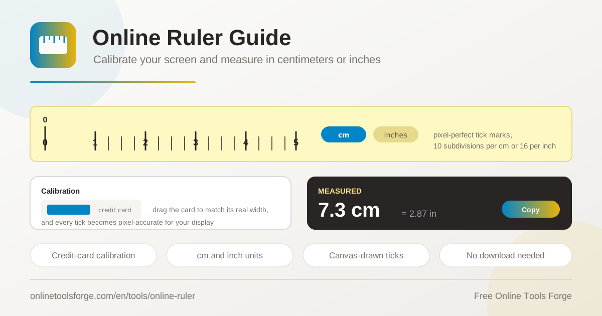
Table of Contents
Need to check the width of a screw, size a photo for printing, or measure a gap behind your desk, but the ruler drawer is empty? The online ruler turns the screen in front of you into a working measuring instrument. It runs 100 percent in your browser, needs no download or installation, and draws a virtual ruler with crisp, pixel-perfect tick marks you can read in centimeters or inches.
Most screen rulers quietly assume every display has the same pixel density, which is simply not true. This tool takes a smarter approach: you calibrate it once with a standard credit card or bank card, dragging an on-screen reference until it matches the physical card on your display. After that quick step, the tick marks correspond to real millimeters and inches on your specific screen.
This guide covers how the tool works, why calibration separates a rough guess from a genuine measurement, and where a virtual ruler saves the day.
Why Use the Online Ruler?
- No downloads or installation. The ruler loads directly in any modern browser, so there is nothing to install, update, or uninstall later.
- Calibrated accuracy. A reference card dragged to its real size maps the tool to your display, so ticks match true centimeters and inches.
- Metric and imperial. Centimeter mode divides each unit into 10 subdivisions, inch mode uses 16 subdivisions, and a toggle switches between them instantly.
- Pixel-perfect tick marks. The ruler is drawn on canvas, keeping every line sharp even on high-density screens.
- Free and private. No account, no paywall, no uploads; measuring happens entirely on your device.
- Always within reach. It lives in a browser tab, ready on your laptop, a friend's computer, or a tablet in the workshop.
Key Features
| Feature | What it does |
|---|---|
| On-screen ruler | A virtual ruler strip drawn on canvas with pixel-perfect tick marks. |
| Centimeter mode | Each centimeter is divided into 10 millimeter subdivisions. |
| Inch mode | Each inch is divided into 16 subdivisions, matching shop-ruler sixteenths. |
| Card calibration | Drag a credit card or bank card outline to the physical card size so ticks match your display. |
| Unit toggle | Flip between centimeters and inches at any time, keeping your calibration. |
- Calibration adapts the whole ruler to your screen, avoiding the outdated 96 PPI assumption baked into many virtual rulers.
- Canvas rendering keeps tick spacing geometrically consistent across the entire visible length.
- Measuring is instant: calibrate once, then read values as fast as you can line up an object.
How to Measure With the Screen Ruler
- Open the tool. Load the online ruler in any modern browser on the screen you want to measure with.
- Grab a reference card. Any standard credit card, debit card, or bank card works, because these cards are made to one worldwide size: 85.6 mm wide.
- Calibrate. Hold the card flat against the display and drag the on-screen reference until its edges line up exactly with the physical card.
- Pick your units. Use the toggle to choose centimeters (10 subdivisions) or inches (16 subdivisions).
- Measure. Lay the object flat against the screen, align its start with the zero mark, and read the tick where the object ends.
Why Calibration Matters
Every display packs a different number of pixels into the same physical space. A 24-inch office monitor, a 13-inch laptop, and a 6-inch phone can show the same window at wildly different pixel densities, so no fixed pixel-to-centimeter ratio can be correct everywhere.
That fixed ratio has a name: the 96 PPI assumption. It dates from early computing, when monitors really showed roughly 96 pixels per inch, and browsers still use it for CSS units. Modern screens range from about 90 PPI on large desktop panels to more than 400 PPI on phones. A ruler trusting 96 PPI on a dense laptop display can be off by 50 percent or more, turning every reading into a guess.
Calibration fixes this with a real-world reference. ISO ID-1 cards such as credit cards and bank cards are produced to the same size everywhere: 85.60 mm wide and 53.98 mm tall. Dragging the on-screen card until it matches the physical card tells the tool how many pixels your display devotes to 85.6 mm, from which it derives an exact pixels-per-millimeter value. The idea reduces to:
pixelsPerMm = cardWidthInPixels / 85.6
objectCm = objectWidthInPixels / pixelsPerMm / 10
Subdivisions matter too. Metric ticks step in clean tenths of a centimeter, which suits engineering, sewing, and schoolwork. Inch mode steps in sixteenths, the standard fraction on hardware-store rulers. Pixel-perfect rendering means each tick is snapped to actual device pixels, so marks stay crisp instead of blurring across fractional pixels on high-density screens.
Practical Use Cases
Checking Small Parts and Craft Pieces
Screws, dowels, beads, wire, and 3D-printed brackets live in the 5 mm to 100 mm range where the screen ruler is most comfortable. Check whether a replacement bolt looks like an M6 or an M8 before ordering, confirm a cut ribbon strip is 3 cm wide, or compare a crochet swatch against a pattern gauge without hunting for a tape measure.
Sizing Photos for Print
Before sending an image to a printer, it helps to know how large it will physically appear. With a calibrated screen you can confirm that a passport-style crop lands near 3.5 by 4.5 cm, or that a stamp-sized print will still show the detail you need. Sixteenth-inch mode helps when a lab quotes sizes in fractions.
Quick Desk Measurements
Is there room behind the monitor for a cable tray? Will that book fit upright on a shelf with 19 cm of clearance? Hold the object against the screen edge and read the answer in seconds — perfect for small gaps, drawer clearances, and frame widths.
Classroom Demonstrations
Project the calibrated ruler to show why a centimeter divides into ten equal millimeters, or practice reading fractional inches in sixteenths. Walking through the card calibration also makes a memorable lesson on why screen pixels and physical units are not the same thing.
Best Practices
- Recalibrate for every screen. Pixels per millimeter is a property of the display, so repeat the card step whenever you switch monitors or devices.
- Keep browser zoom at 100 percent. Zoom changes how many pixels each element occupies and would throw off both calibration and readings.
- Use an undamaged card. A bent or worn card distorts the reference, so pick the straightest card in your wallet.
- Measure flat against the glass. Press the object to the screen surface and view it straight on to avoid parallax error.
- Sanity-check the result. Measure a coin or a AA battery after calibrating to confirm readings feel right.
- Know the limits. A calibrated screen ruler excels at quick checks and comparisons; precision work still belongs to a physical tool.
Start Measuring in Seconds
The next time a small measurement question appears, skip the drawer hunt. Open the online ruler, spend twenty seconds calibrating with any bank card, and enjoy pixel-perfect centimeter and inch readings in your browser — free, private, and always ready.
Related Tools You Might Like:
- Bubble Level — check whether a surface or frame is truly level.
- PPI Calculator — compute your display pixel density for a second opinion on calibration.
- Angle Converter — convert between degrees, radians, and gradians when numbers need translating.
Happy measuring!
Frequently Asked Questions
Q: Is the online ruler really accurate?
A: After card calibration it is accurate enough for quick estimates and comparisons, typically within a millimeter over a 10 cm span on a flat, undistorted screen. For precision work, use a physical ruler or caliper.
Q: Why must I calibrate with a credit card?
A: Displays differ in pixel density. The card is a worldwide standard at 85.6 mm wide, so matching it on screen tells the ruler exactly how many pixels one millimeter occupies on your display.
Q: Does it work on phones and tablets?
A: Yes, any device with a browser works. A smaller screen simply limits the maximum length you can measure in one pass.
Q: Is anything uploaded or tracked?
A: No. Calibration and measuring happen entirely in your browser, and no measurements leave your device.