shadcn/ui Theme Generator: Build Custom HSL Themes for globals.css in Seconds
Generate a complete shadcn/ui theme with the shadcn/ui Theme Generator — HSL CSS variables, corner radius, light and dark mode, and a live preview, all ready to paste into globals.css.
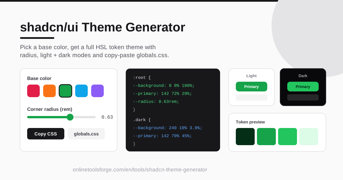
Table of Contents
Every shadcn/ui project draws its visual identity from a short block of CSS variables at the top of globals.css. Change those tokens and every button, card, dialog, and badge updates at once — but only if you can produce a coherent set in the first place. Hand-converting hex values to HSL, balancing light and dark variants, and keeping a radius system consistent is tedious, error-prone work.
The shadcn/ui Theme Generator collapses all of that into a single screen. Pick a base color and the tool instantly generates the full set of shadcn/ui HSL CSS variable tokens, a corner radius in rem, and matching light and dark mode blocks, then hands you a copy-paste-ready globals.css output, validated by a live preview that renders a primary button, a card, and muted surfaces.
This guide covers what the tool does, how to use it in five steps, and what goes on inside those HSL tokens.
Why Use shadcn/ui Theme Generator?
- Save hours of manual token math. Converting a brand hex into the HSL channels shadcn/ui expects, then deriving the supporting variants, is slow. The generator does it instantly and consistently.
- Copy-paste-ready output. The result is a properly formatted globals.css snippet: paste, save, and your whole component library re-skins itself.
- Light and dark in one pass. The tool emits both the :root block and the .dark block, so dark mode is never an afterthought.
- A radius system that scales. Corner radius is generated in rem and wired into shadcn/ui's rounding utilities, so buttons, cards, and dialogs stay in proportion.
- Instant visual feedback. The live preview shows a primary button plus card and muted surfaces, so you can sanity-check contrast and mood.
- No setup required. It runs entirely in the browser — no account, no install, no upload.
Key Features
Here is what the generator puts on screen:
| Feature | What it does |
|---|---|
| Base color picker | Choose any base color; the tool derives the entire token set from it. |
| Full HSL token set | Generates every shadcn/ui variable, from background and primary to muted, border, and ring, in HSL format. |
| Corner radius control | Adjust --radius in rem and watch every rounded element respond. |
| Light and dark blocks | Outputs :root for light mode and .dark for dark mode, always in sync. |
| Live preview | Renders a primary button plus card and muted surfaces using your current theme. |
| Copy CSS button | Copies the whole theme as a paste-ready globals.css block. |
Worth calling out:
- The HSL values follow the exact raw-channel format shadcn/ui documents, so they drop into existing projects without reformatting.
- Because everything derives from one base color, the light and dark palettes stay perceptually related instead of drifting apart.
- Iteration is fast: tweak the color or radius, glance at the preview, and copy again in seconds.
How to Use shadcn/ui Theme Generator
The whole workflow takes under a minute:
- Pick your base color. Use the color picker to select the hue that anchors your brand; the entire token set derives from this one choice.
- Tune the corner radius. Adjust the radius control (in rem) until the previewed button and card feel right — smaller values read sharp, larger ones soft and friendly.
- Check the light and dark previews. Compare both modes in the live preview: the primary button should stand out and text should stay readable on muted surfaces in each.
- Copy the CSS. Hit the Copy CSS button to grab the complete theme, :root and .dark blocks included.
- Paste into globals.css. Replace the token block at the top of your project's globals.css with the copied output, save, and reload. Every shadcn/ui component picks up the new theme automatically.
Understanding shadcn/ui CSS Variables
The output looks unusual at first: tokens like --primary: 142 72% 29% have no hsl() wrapper and no commas — just three raw HSL channels separated by spaces. That is deliberate. shadcn/ui components never read --primary directly; they read it through Tailwind utilities that wrap the value in hsl(), as in hsl(var(--primary)). If the variable contained the hsl() function itself, that wrapper would break and color utilities would resolve to invalid CSS.
Storing raw channels also buys flexibility: you can apply opacity by extending the wrapper to hsl(var(--primary) / 0.5), and foreground/background pairs stay composable. That is why the generator emits this format rather than hex or rgb — it is what the component library was designed to consume.
The .dark block matters just as much. When dark mode activates (usually a class on the html element), the .dark selector overrides the same variables with dark-optimized values: brighter foregrounds, darker backgrounds, and slightly adjusted primaries for readability on near-black surfaces. Because both blocks come from the same base color, the two modes stay visually consistent.
Finally, --radius scales the entire component library. shadcn/ui derives its rounded-sm through rounded-xl utilities from calc(var(--radius) - Xpx), so one rem value controls how every button, card, dialog, and input rounds. Shift the radius in the generator and the whole design language moves from angular to soft without touching a component.
Practical Use Cases
Matching a Brand Color Fast
A client hands you a logo and a hex code. Paste it into the generator, set the radius to match their existing UI, and copy the theme — their whole shadcn/ui app is on-brand within minutes, including a dark mode they may not have asked for yet.
Prototyping Themes for Clients
When creative direction is still fluid, generate three or four candidate themes and screenshot each preview. Stakeholders react to something concrete faster than to a grid of swatches, and switching direction costs seconds, not a refactor.
Consistent Dark Mode from Day One
Dark mode is usually bolted on late — exactly when inconsistencies appear. Because the .dark block ships alongside the light tokens, every new project has a coherent dark palette before the first component is written.
Cleaner Design Handoff
Rather than passing a mockup and hoping it gets translated faithfully, attach the generated globals.css snippet to the ticket. The implementation becomes the spec: same variables, same radius, same behavior on both sides of the handoff.
Best Practices
- Check contrast on --primary before shipping. The preview gets you close, but for text-heavy buttons confirm that white-on-primary still passes WCAG AA, especially with saturated mid-tone hues.
- Keep radius consistent app-wide. Resist ad hoc rounded-lg overrides; let --radius drive every corner so the system stays coherent.
- Commit the generated tokens. Store the output in version control alongside your code — these variables are your design system's source of truth.
- Keep light and dark in sync. If you hand-edit a variable, mirror the change in the other block; asymmetries surface later as "broken dark mode" bugs.
- Avoid one-off hex values in components. If a color is not exposed as a token, promote it to one instead of hardcoding it inside a component file.
- Regenerate when branding changes. Re-running the generator from the new base color is faster and safer than patching variables by hand.
Ready to re-skin your next project? Open the shadcn/ui Theme Generator, drop in a base color, and copy a production-ready globals.css theme in under a minute.
Related Tools You Might Like:
- Color Palette Generator — build a full palette from a single color.
- Border Radius Generator — experiment with corner values across element types.
- Box Shadow Generator — add matching elevation to cards and dropdowns.
Happy theming!
Frequently Asked Questions
Q: Do I need to install anything to use the generator? A: No. It runs entirely in your browser. Pick a color, tune the radius, and copy the CSS — nothing is uploaded anywhere.
Q: Why are values written as raw numbers like 142 72% 29% instead of hsl(142 72% 29%)? A: shadcn/ui components consume these variables through hsl(var(--primary)) wrappers. Storing only the raw channels keeps that wrapper valid and lets utilities apply opacity with the / alpha syntax.
Q: Does the generated theme work with Tailwind CSS v4? A: Yes. The output is plain CSS variables in the standard shadcn/ui format, so it works whether your project maps colors in tailwind.config (v3) or wires them through the @theme layer (v4).
Q: Can I use the theme in a project that does not use shadcn/ui? A: Absolutely. The variables are ordinary CSS custom properties. Reference them with hsl(var(--primary)) in any stylesheet or component, with or without Tailwind.