Typography Scale Generator: Build Perfect Font Hierarchies With Musical Ratios
Create modular type scales with the free Typography Scale Generator. Pick Major Third, Perfect Fourth, or Golden Ratio presets and export CSS variables or a Tailwind fontSize config in seconds.
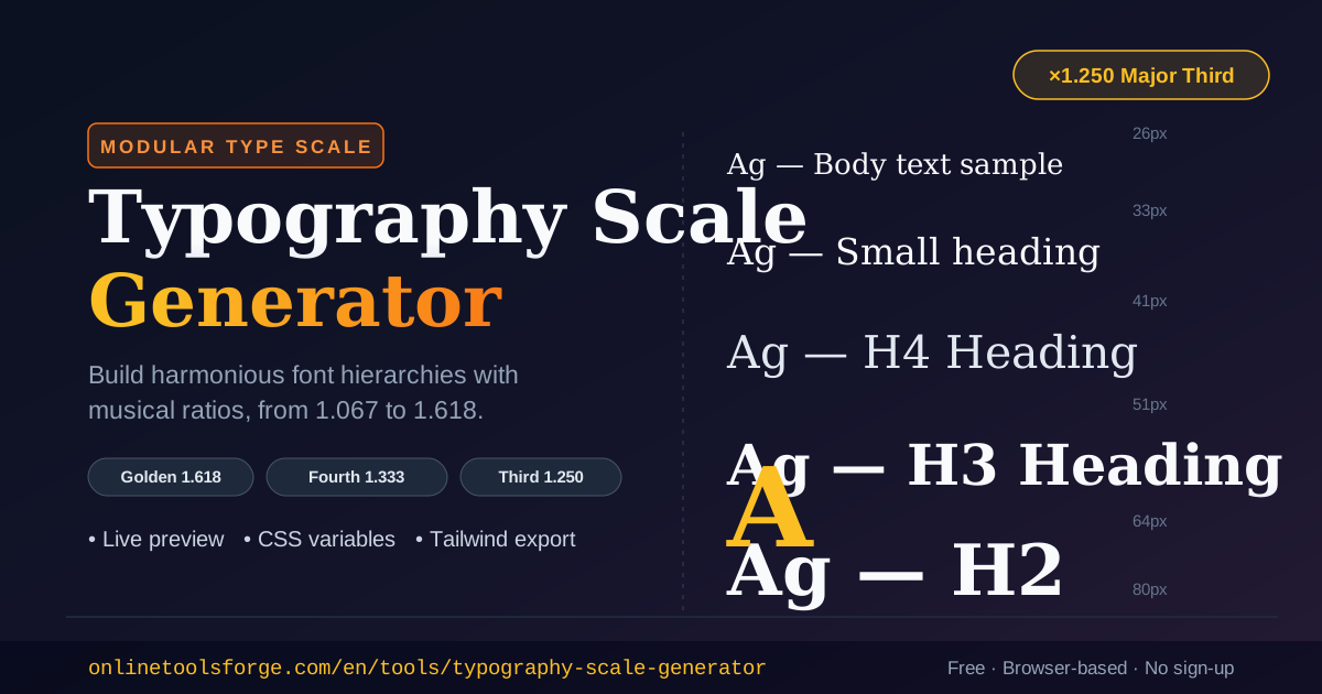
Table of Contents
Typography Scale Generator: Build Perfect Font Hierarchies With Musical Ratios
Every well-designed interface has one thing in common: a deliberate font size hierarchy. Headings step down gracefully, body text sits comfortably at reading size, and captions feel intentionally smaller — nothing is arbitrary. Yet most projects still start with hand-picked values like 14px, 18px, 24px, and 32px that look reasonable individually but lack any mathematical relationship to each other.
The Typography Scale Generator fixes this by building a modular type scale: you choose a base size and a ratio, and every size in your hierarchy is derived by multiplying repeatedly by that ratio. The result is a set of font sizes that feel harmonious because they follow the same proportional logic found in music, architecture, and nature.
The tool is completely free, runs entirely in your browser, and exports production-ready CSS custom properties or a Tailwind fontSize config in seconds. No sign-up, no uploads, no guesswork.
Why Use a Typography Scale Generator?
- Consistency across the whole interface — every heading and text element derives from one base size and one ratio, so your hierarchy stays mathematically coherent instead of accumulating one-off pixel values.
- Faster design decisions — instead of debating whether a heading should be 30px or 34px, the scale answers for you: multiply the previous level by your ratio.
- Musical ratios produce natural harmony — intervals like the Major Third (1.250) and Perfect Fourth (1.333) have pleased the human ear for centuries, and the same proportions translate remarkably well to visual rhythm.
- Design tokens out of the box — the generator emits CSS custom properties, so your scale becomes a maintainable token set rather than scattered inline values.
- Tailwind-ready output — copy a complete fontSize config block and paste it straight into your Tailwind theme without hand-converting units.
- Zero friction — everything runs client-side in your browser. Your sizes, previews, and settings never leave your device.
Key Features
| Feature | What You Get |
|---|---|
| Eight ratio presets | Minor Second (1.067) through Golden Ratio (1.618), from subtle to dramatic |
| Custom ratio input | Any multiplier above 1.0 for brand-specific or experimental scales |
| Live preview | Every scale level rendered at real pixel size as you adjust settings |
| Per-level copy | Each step copies as a rem value with the px equivalent in a comment |
| Full export | Whole scale as CSS custom properties or a Tailwind fontSize config |
| Adjustable base and steps | Base size from 8–64px and 4–8 scale levels to fit any system |
A few of these deserve a closer look. The live preview is rendered at true rendered size, not a mockup — what you see is exactly what ships. The per-level copy button outputs --fs-3: 1.563rem; /* 25px */ style snippets, so you always know the pixel reality of every rem value you paste. And the Tailwind export produces a ready-to-paste module.exports block wired into theme.extend.fontSize, keeping your text-* utilities aligned with the scale.
How to Use
- Pick your base size. Most web projects stay with the browser default of 16px for body text, and the generator defaults to exactly that — but you can set anything from 8px to 64px.
- Choose a ratio preset. Start with Major Third (1.250) or Perfect Fourth (1.333); both are versatile defaults for screen typography. Feeling adventurous? Enter a custom ratio instead.
- Set the number of steps. Choose between 4 and 8 levels. Four to five steps cover most landing pages; six to eight suit documentation sites and design systems.
- Review the live preview. Each level renders at its real size with its rem and px values shown, so you can judge the visual rhythm before committing.
- Copy your output. Grab individual levels with their per-level copy buttons, or export the whole scale as CSS variables or a Tailwind config and drop it into your project.
Understanding Modular Scales
A modular scale starts from a base value and a ratio, then generates each successive step by multiplying by the ratio again. With a 16px base and the Major Third ratio (1.250), the sequence runs: 16 → 20 → 25 → 31.25 → 39.06 → 48.83px. Five multiplications and you have a complete heading hierarchy where every size relates to every other size by the same proportion.
The preset names come from musical intervals, and each has a distinct personality:
- Minor Second (1.067) and Major Second (1.125) — subtle, restrained steps. Ideal for dense UIs, dashboards, and documentation where you need many levels without dramatic jumps.
- Minor Third (1.200) and Major Third (1.250) — the workhorses of web typography. Clear hierarchy with moderate contrast between levels; the Major Third is a default worth sticking with.
- Perfect Fourth (1.333) and Augmented Fourth (1.414) — bold, confident jumps that suit marketing pages, portfolios, and editorial layouts with few, large headings.
- Perfect Fifth (1.500) and Golden Ratio (1.618) — dramatic, display-oriented scales. Best when you want poster-like contrast between a hero heading and body copy.
A practical note on units: always use rem, not px, in your shipped CSS. The generator exports rem precisely for this reason — rem values respect the user's browser font-size preference, which is essential for accessibility, while the px comments keep the computed sizes transparent during development.
Practical Use Cases
Landing Pages and Marketing Sites
Marketing pages live and die by visual hierarchy. A Perfect Fourth (1.333) scale from a 16px base gives you 16 → 21 → 28 → 38 → 50 → 67px — an emphatic hero headline at 67px, section headings at 38–50px, and readable body copy underneath. Export the CSS variables once and every page on the site inherits the same rhythm.
Design Systems and Component Libraries
A design system needs a token set, not ad-hoc sizes. Generate a six-step Major Third scale, export it as CSS custom properties, and map them to semantic tokens like --text-body, --text-h3, and --text-display. Every component then references tokens, and adjusting the base size or ratio in one place re-tunes the entire system.
Documentation and Dashboards
Information-dense interfaces need subtler steps so text levels nest without wasting vertical space. A Minor Third (1.200) scale produces gentle 20% increments — enough to distinguish an h3 from an h4 in long-form docs, yet compact enough that a dense settings panel still feels tidy.
Editorial and Blog Themes
Long-form reading benefits from a slightly larger base — try 18px with a Major Second (1.125) or Minor Third (1.200). The small steps keep multi-level headings from shouting, while the scale still guarantees every level is proportionally related. Pair the output with a comfortable measure and line height for effortless reading.
Best Practices
- Start with Major Third or Perfect Fourth — they suit the widest range of projects. Reach for subtler ratios for dense UIs and bolder ones for display-driven pages.
- Keep body text at 16px or above — smaller bases compromise readability; scales work best when the base is a comfortable reading size.
- Limit yourself to the scale — the value of a modular scale comes from discipline. If a size isn't in the scale, either the design doesn't need it or the scale needs rethinking.
- Export rem, display px — ship rem values for accessibility and keep the px comments the generator provides for quick sanity checks in code review.
- Revisit the ratio per project, not per page — one scale per product keeps the brand coherent. Changing ratios between pages fragments the visual identity.
- Combine with a spacing scale — a type scale singes hardest when spacing follows a similar proportional system, so your margins and padding echo the same rhythm.
Ready to Build Your Scale?
Stop eyeballing font sizes. Open the Typography Scale Generator, pick a ratio, and copy a complete, harmonious type scale into your project in under a minute — free, private, and entirely in your browser.
Related Tools You Might Like:
- CSS Font Stack Generator — pair your type scale with a robust, well-supported font stack.
- CSS Clamp Generator — turn fixed scale steps into fluid sizes that interpolate between viewports.
- Gradient Text Generator — give your largest scale levels an eye-catching gradient treatment.
Happy designing!
Frequently Asked Questions
Q: What is a modular type scale?
A: A modular type scale is a set of font sizes generated by repeatedly multiplying a base size by a fixed ratio. For example, a 16px base with a 1.250 ratio produces 16, 20, 25, 31.25px, and so on. Because every size shares the same proportional relationship, the resulting hierarchy looks harmonious and intentional.
Q: Which ratio should I choose for my project?
A: Major Third (1.250) and Perfect Fourth (1.333) are the most versatile starting points for websites. Use subtler ratios like Major Second (1.125) for dense interfaces and documentation, and bolder ratios like Golden Ratio (1.618) for marketing pages with large display headings.
Q: Does the generator output px or rem values?
A: Both. The exported values are rem-based (which respects the user's browser font-size settings for accessibility), and every value includes its pixel equivalent in a comment so you can verify computed sizes at a glance.
Q: Can I use the output with Tailwind CSS?
A: Yes. The tool exports a ready-to-paste fontSize config block for your Tailwind theme. Paste it into theme.extend.fontSize and all of your text-* utilities will use the scale immediately.
Q: Is my data sent anywhere?
A: No. The generator runs entirely in your browser — no uploads, no accounts, and no data leaves your device.