CSS Spinner Generator: Build Pure-CSS Loading Spinners in Seconds
A practical guide to the CSS Spinner Generator — pick a style preset, tune size, color, and speed with a live preview, then copy clean HTML and CSS that needs no JavaScript.
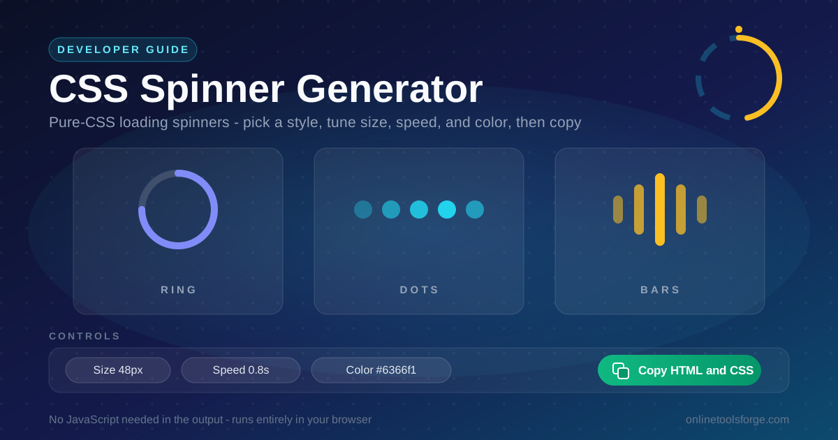
Table of Contents
CSS Spinner Generator: Build Pure-CSS Loading Spinners in Seconds
Every application waits sometimes — for an API response, a form submission, or an image to arrive. A missing loading state makes a fast app feel broken: the user clicks, nothing visibly happens, and within a second they assume the site has frozen. The fix is cheap, and the CSS Spinner Generator builds it in seconds.
Instead of hunting for an animated GIF or pulling in a spinner library, you pick a style preset, dial in the size, color, and speed, and watch the result animate in a live preview. One click copies clean HTML and CSS with no images and no scripts — just standard CSS that rotates, pulses, or bounces.
Why Use CSS Spinner Generator?
- Pure CSS, zero image assets — an animated GIF adds a request, blurs on high-DPI screens, and never recolors. These spinners are drawn with borders, circles, and bars and stay crisp at any size.
- No JavaScript library required — the output runs on CSS alone. There is no dependency, no bundle weight, and nothing to break when scripts load slowly or are blocked.
- Live preview while you tune — every change to size, speed, or color updates the animated preview instantly, so you compare options instead of saving files and refreshing.
- currentColor keeps theming effortless — spinners can inherit the text color of their container, so one snippet works across light themes, dark themes, and brand palettes.
- Motion you can make accessible — CSS spinners respond to prefers-reduced-motion and pair with role="status" for screen readers. GIFs offer neither hook.
- Free, private, and instant — it runs entirely in your browser with no account, settings never leave your machine, and the code is yours the moment you copy it.
Key Features
| Feature | What It Does |
|---|---|
| Style presets | Switch between ring, dots, and bars families, with variations like partial-arc rings and equalizer bars. |
| Size control | Set exact pixel dimensions so the same spinner fits a button, a card, or a full-page overlay. |
| Color control | Pick any hex value, or choose currentColor to inherit the surrounding text color. |
| Speed control | Dial the duration into the calm, perceptible range instead of a frantic blur. |
| Live preview | See every change animate exactly as it will appear in production. |
| Copy HTML and CSS | Grab a minimal HTML snippet and a tidy CSS block in one click. |
Two details make the output especially practical:
- The markup is a single element or a tiny group, so it drops into any layout without wrapper divs.
- The CSS animates only transform, opacity, and border, which browsers run on the compositor for smooth motion.
How to Use
- Pick a style preset. Choose the family that fits the context — a ring for general-purpose loading, dots for inline waits, bars for a playful, energetic feel.
- Set the size. Common choices are 16 to 20 px for buttons, 32 to 48 px for cards and panels, and 64 px or more for full-page loading screens.
- Choose the color. Enter a hex value to match your brand, or select currentColor so the spinner follows the text color of its container.
- Tune the speed. Adjust the duration while watching the preview, aiming for motion you can clearly perceive but never have to wait for.
- Copy the HTML and CSS. When the preview looks right, paste the two snippets into your project. That is the entire integration.
Spinners Without JavaScript
The best-known pure-CSS spinner is the border-trick ring, and its anatomy explains most other styles too:
.spinner {
  width: 48px;
  height: 48px;
  border: 5px solid rgba(99, 102, 241, 0.2);
  border-top-color: #6366f1;
  border-radius: 50%;
  animation: spin 0.8s linear infinite;
}

@keyframes spin {
  to {
    transform: rotate(360deg);
  }
}
A square element gets a thick border and border-radius: 50%, which turns the borders into a ring: three faint translucent segments form the track while the top border is the opaque accent, and rotating the element makes the accent chase the track forever. Dots and bars are the same idea — static shapes whose opacity or transform animate with staggered delays.
Speed deserves deliberate attention. Below half a second per cycle a spinner reads as frantic and makes a two-second wait feel longer; above about a second and a half it starts to look broken. The perceptible-but-not-anxious range sits between 0.6 and 1.2 seconds with a linear timing function, so the loop never visibly accelerates — motion that communicates progress without demanding attention.
Sizing and theming become trivial with currentColor: a spinner using border-top-color: currentColor inherits the color of its parent. Set the color once on a container — gray in light mode, white inside a primary button — and every spinner inside follows, so one snippet serves a whole design system.
Accessibility is the last piece. Give the loading region role="status" (or set aria-busy="true" on the refreshing container) and include a visually hidden label such as <span class="visually-hidden">Loading...</span>. Then slow the animation inside a @media (prefers-reduced-motion: reduce) query for users who asked the operating system for less motion — reduce the speed, do not remove the state.
Practical Use Cases
Fetch and API Request States
Anywhere data arrives asynchronously — search results, dashboards, comment threads — a spinner inside the updating region tells users the request is in flight. Keep it visible until the first content renders.
Form Submissions and Button Feedback
On submit, swap the button label for a small 16 to 20 px spinner and disable the control. That prevents double submissions, confirms the click registered, and sets expectations for the wait.
Image and Lazy-Loaded Content
Large photos take noticeable time on slow connections. A spinner overlaid on the image frame fills the reserved space and prevents content jumping up the page once bytes arrive.
Complementing Skeleton Screens
Skeletons and spinners solve different problems, and strong interfaces use both. Skeleton placeholders — easy to build with the Skeleton Loader Generator — map out content-heavy pages, while spinners handle compact, in-place waits like a button press or filter refresh.
Best Practices
- Show the spinner after roughly 300 milliseconds, not instantly. Most requests finish before users notice a delay, and a spinner that flashes for a tenth of a second reads as flicker.
- Pair spinners with skeleton screens for content areas. Skeletons fit when the incoming layout is known; spinners fit indeterminate waits.
- Test the spinner on both themes. A light gray ring vanishes on white and a dark one vanishes in dark mode, so check the contrast of the container's text color.
- Keep one loading indicator per region. Five competing spinners feel chaotic; localize each indicator and leave the rest of the page stable.
- Stay inside the 0.6 to 1.2 second band. Revisit speed when you resize — a rate that looks calm at 48 px can feel frantic at 16 px.
- Always provide an exit from the state. If a request can fail, the spinner must give way to an error message with a retry — an infinite spinner is just a prettier way of saying the app is broken.
Start Generating Spinners Today
Loading states are among the highest-leverage details in interface design: a few lines of CSS separate an app that feels broken from one that feels responsive. Open the CSS Spinner Generator, tune the controls against the live preview, and copy production-ready HTML and CSS in under a minute — no sign-up, no dependencies, no JavaScript in the output.
Related Tools You Might Like:
- Skeleton Loader Generator — Build shimmering placeholder layouts for content-heavy pages.
- CSS Animation Generator — Design custom keyframe animations with a live preview and copy the CSS.
- CSS Tooltip Generator — Create styled, positioned tooltips in pure CSS.
Happy spinning!
Frequently Asked Questions
Q: Do the generated spinners need JavaScript?
A: No. The tool runs in your browser, but the code it produces is pure HTML and CSS — rotation, pulsing, and bouncing are driven entirely by CSS keyframe animations, so it works even where scripts are disabled.
Q: How do I match the spinner to my brand color?
A: Enter a hex value for an exact match, or choose currentColor so the spinner inherits its parent's CSS color. One snippet then adapts to every theme without edits.
Q: Can I use the spinners in React, Vue, or other frameworks?
A: Yes. Paste the CSS into a global stylesheet, CSS module, or your styling solution of choice, then add the HTML snippet as JSX or template markup.
Q: Why does my spinner look jittery?
A: Jitter usually comes from animating layout properties or a non-linear easing curve. Keep rotation on transform with a linear timing function, and avoid animating width or height.