CSS Tooltip Generator: Build Pure CSS Tooltips Without JavaScript
Design pure CSS tooltips with position, arrow, colors, and hover or focus triggers. Live preview plus copy-paste HTML and CSS — no JavaScript required.
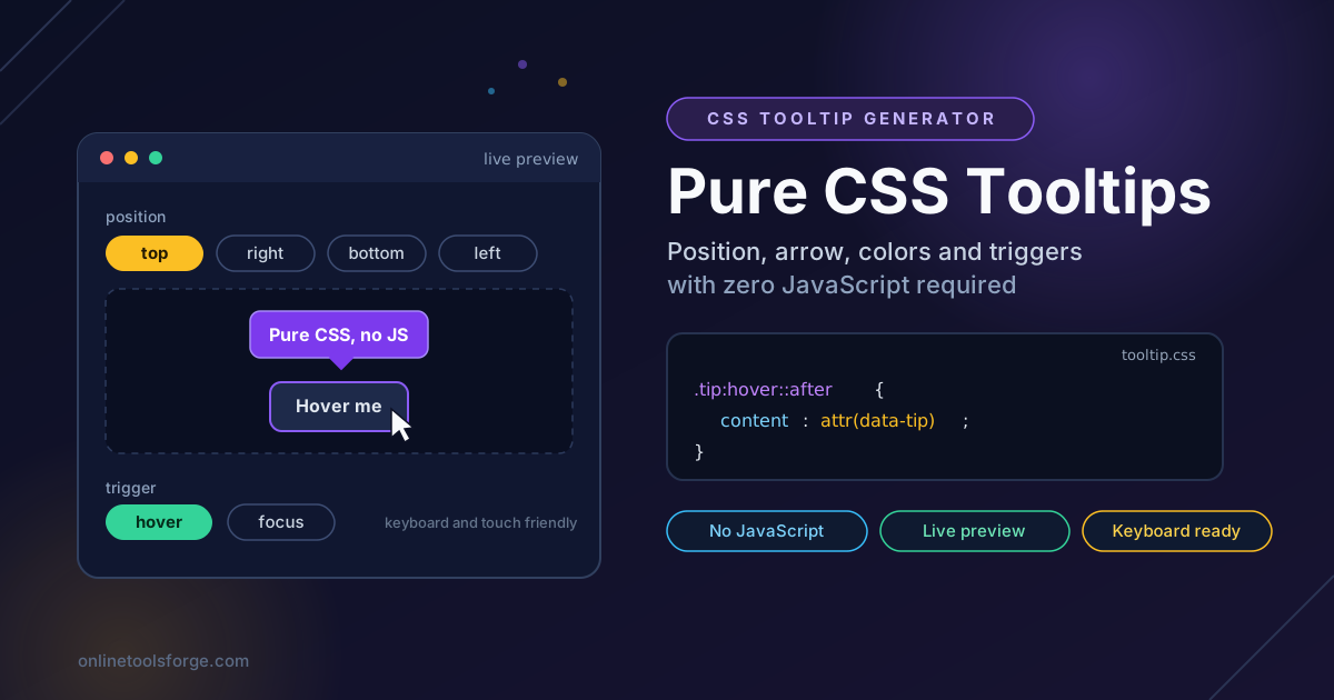
Table of Contents
CSS Tooltip Generator: Build Pure CSS Tooltips Without JavaScript
Tooltips are the quiet workhorses of interface design. They explain icon-only buttons, define abbreviations, and surface hints at the exact moment a user needs them — without cluttering the UI with permanent labels. Too often, though, they are built with a heavyweight JavaScript library that adds bundle weight and breaks keyboard access. The CSS Tooltip Generator takes the lightweight path: configure the tooltip visually, watch it in a live preview, and copy clean HTML and CSS that runs with zero JavaScript.
Because the output is pure CSS, the tooltip loads instantly, inherits your fonts, and keeps working even when scripts fail or are blocked. You choose the position, toggle the arrow, pick background and text colors, and decide which triggers reveal it — hover for mouse users and focus for keyboard users.
This guide covers what the tool does, how the hover and focus trigger pattern works, and the pitfalls and practices that keep tooltips usable on every device.
Why Use CSS Tooltip Generator?
- Zero JavaScript dependency. The tooltip uses only HTML and CSS — nothing to install, no library to update, no render-blocking script.
- Live preview while you configure. Every change to position, arrow, color, or trigger updates the preview immediately, so you never paste code blind.
- Copy-paste HTML and CSS. The tool emits a minimal HTML snippet and a matching stylesheet block that drops into any project, framework or not.
- Four positions and a real arrow. Top, right, bottom, and left placement each come with a properly aligned, color-matched arrow.
- Keyboard accessible by default. Enabling the focus trigger means keyboard users tabbing to the trigger see exactly what mouse users see.
- 100% client-side and free. Configuration happens entirely in your browser; nothing is uploaded and no account is required.
Key Features
| Feature | What It Does |
|---|---|
| Position selector | Places the bubble above, below, or to either side of the trigger element. |
| Arrow toggle | Adds a pointing arrow that stays color-matched to the bubble. |
| Color pickers | Sets background and text colors with instant feedback in the preview. |
| Trigger options | Chooses hover, focus, or both so pointer and keyboard users get the same information. |
| Live preview | Renders the configured tooltip in real time as you adjust settings. |
| Generated code | Outputs a compact HTML snippet plus the complete CSS block, ready to copy. |
| Copy buttons | Copies the HTML and CSS separately with one click each. |
- The HTML keeps the tooltip text in a data-tip attribute, so editing a tooltip never means touching the stylesheet.
- The CSS separates appearance from visibility, which makes the transition easy to adjust later.
- Everything runs client-side, so experimenting costs nothing and sends nothing anywhere.
How to Use
- Open the tool and pick a position. Launch the CSS Tooltip Generator and select top, right, bottom, or left. Top is the common default, but flip to bottom near the top edge of the viewport.
- Toggle the arrow and tune the spacing. Turn the arrow on when the bubble must clearly point at its trigger, and adjust the offset so the two read as connected.
- Set the colors. Pick a background and text pair with strong contrast, then confirm the result in the live preview.
- Enable both triggers. Switch on hover and focus together. Hover covers pointer users; focus ensures tabbing to the trigger reveals the same tooltip.
- Copy the code into your project. Paste the HTML and CSS, rename the classes to your convention, and replace the placeholder text. That is the entire integration.
Tooltips Without JS
The hover and focus trigger pattern. A pure CSS tooltip is a hidden bubble that becomes visible when its trigger matches a pseudo-class. The generated code pairs them deliberately:
.tooltip:hover .tooltip-bubble,
.tooltip:focus .tooltip-bubble {
  opacity: 1;
  visibility: visible;
}
The :hover rule serves pointer users, while :focus keeps the pattern keyboard accessible. For the focus rule to fire, the trigger must be focusable — a real button or link already is, and the generated snippet adds tabindex="0" when the trigger is a plain span. Pairing the bubble with aria-describedby lets screen readers announce it too.
Arrow construction: borders or rotated squares. Two classic techniques build a CSS arrow. The border trick uses a zero-size element whose three transparent borders and one colored border form a triangle. The rotated-square trick tucks a small square, rotated 45 degrees, half under the bubble. The generator uses the rotated square because it color-matches the bubble exactly and needs no border-width arithmetic.
Position and the overflow pitfall. The bubble is absolutely positioned relative to its trigger, so a parent with overflow: hidden clips it silently. This is the most common "my tooltip disappeared" report, and it usually traces back to a card, table wrapper, or carousel. The fixes, in order of preference: move the tooltip outside the clipping container, remove overflow: hidden where it is not genuinely needed, or flip the bubble to the side with room — which also solves tooltips clipping at the viewport border.
Touch devices have no hover. On phones and tablets there is no pointer to hover, so a hover-only tooltip is effectively invisible, and tapping a non-focusable element fires hover unreliably. Pairing hover with focus solves this: when the trigger is a real button, a tap gives it focus and reveals the tooltip. For hints that must be readable on touch, show the text persistently instead.
Timing and pointer-events. A transition of about 150 milliseconds makes the bubble feel responsive without lag. A small transition-delay on hide lets the pointer cross a few pixels of gap without dismissing the bubble. Finally, the generated CSS sets pointer-events: none on the bubble, so the pointer can never land on the tooltip and trap the user in a flicker loop.
Practical Use Cases
Icon-Only Buttons
Trash cans, gear icons, and share arrows save space but hide their meaning. A tooltip restores the label on hover and focus without spending permanent layout space on text.
Form Field Hints
Password rules, date formats, and why a field is required fit naturally in a tooltip on a small help icon. Triggering on focus helps most here: keyboard users tabbing into the field see the requirements.
Table Abbreviations
Dense data tables rely on codes and acronyms — currency codes, status flags, unit abbreviations. A tooltip-bearing trigger defines each term on demand, keeping headers compact yet self-explanatory.
Status Indicators
A colored dot can mean healthy, degraded, or offline, and color alone says nothing to color-blind users. A tooltip spells out the state in words whenever someone points at it or tabs to it.
Best Practices
- Never put critical information only in a tooltip. Warnings, pricing, and error explanations must be visible by default; a tooltip supplements, never replaces.
- Keep the text short. One sentence is ideal. Tooltips are for glances, and long bubbles overflow the viewport and the reader's patience.
- Always pair hover with focus. It costs one extra selector and makes the same information available to keyboard users.
- Check contrast on both levels. The bubble against the page and the text against the bubble both need sufficient contrast.
- Watch for overflow:hidden ancestors. Test tooltips inside cards, tables, and modals, where clipping bugs live.
- Test with a keyboard and a phone. Tab through the page and tap the trigger on a real device before shipping.
Try CSS Tooltip Generator Now
Open the CSS Tooltip Generator, pick a position, set your colors, and copy production-ready HTML and CSS in under a minute. No sign-up, no dependencies, no JavaScript — just tooltips that work with a mouse, a keyboard, or anything in between.
Related Tools You Might Like:
- CSS Animation Generator — build keyframe animations visually and copy production-ready CSS, a natural companion for tooltip entrance effects.
- CSS Spinner Generator — create pure CSS loading spinners for the moments a tooltip is not enough feedback.
- CSS Unit Converter — convert between px, rem, em, and more when adapting tooltip sizes to your type scale.
Happy styling!
Frequently Asked Questions
Q: Do the generated tooltips really need no JavaScript?
A: Correct. Visibility is driven entirely by the CSS hover and focus pseudo-classes. JavaScript only becomes necessary for advanced behavior such as repositioning on scroll.
Q: Why is my tooltip cut off or invisible in production?
A: Almost always an ancestor with overflow: hidden is clipping the absolutely positioned bubble. Move the tooltip outside the clipped container, drop the hidden overflow, or flip the bubble to the other side.
Q: How do keyboard users see the tooltip?
A: The generated CSS pairs :hover with :focus, and the HTML makes the trigger focusable. Tabbing to the trigger shows the same bubble a mouse user sees, and screen readers can announce it via the included aria-describedby reference.
Q: Do these tooltips work on touch screens?
A: Partly. There is no hover on touch devices, but when the trigger is a real button or link, tapping it receives focus and reveals the tooltip. For essential hints, prefer showing the text permanently on small screens.